Building the ManyPets Unpack design system
While working on the new US pet insurance launch for ManyPets, I worked together with a team of developers to establish a new design system and UI kit while the new brand was being developed.
The challenge
In order to manage the rebrand, the launch of ManyPets on the US market, and increase the velocity of future builds, I needed to collaborate closely with developers, engineering managers and marketing in order to establish a solid foundation for the new UI patterns.
Contribution
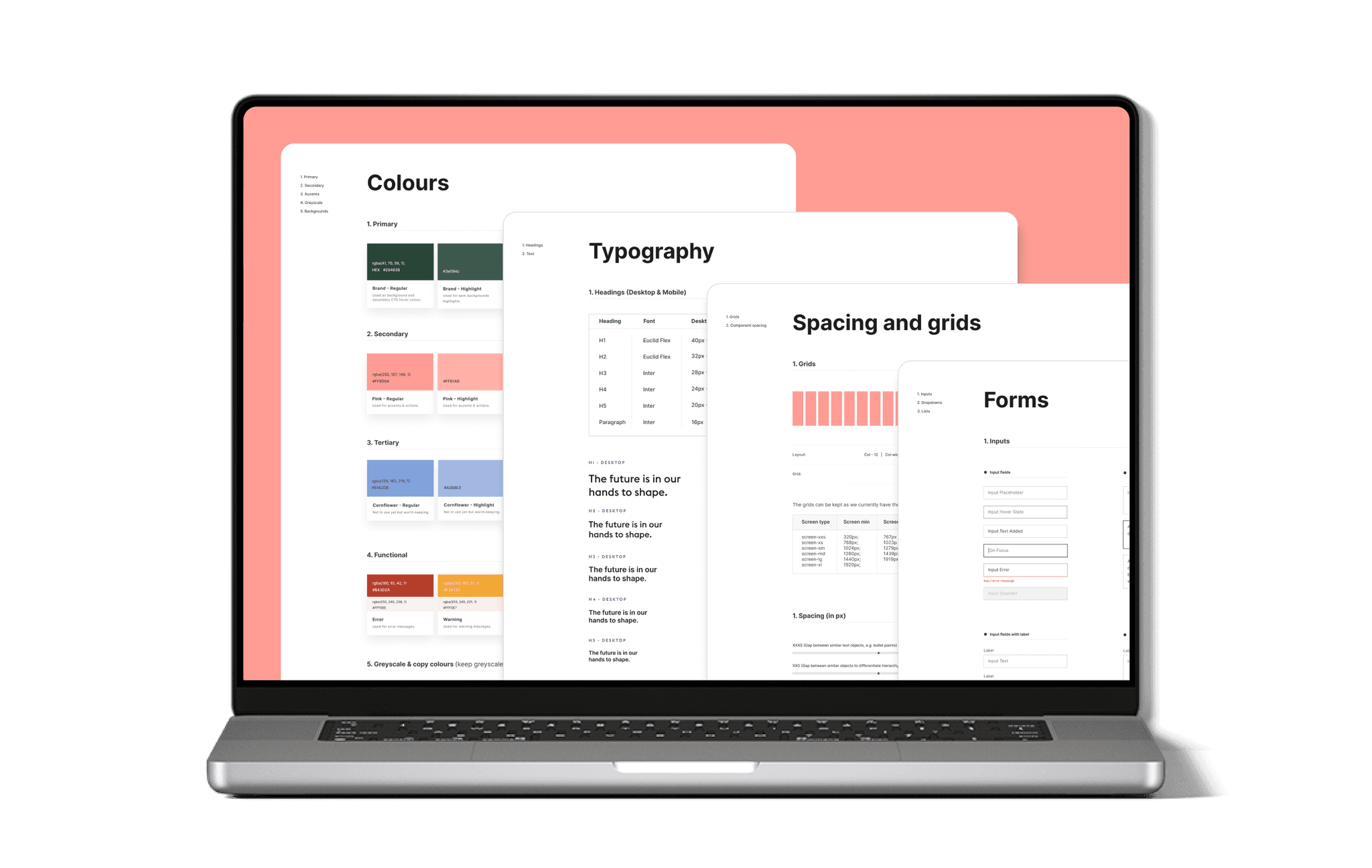
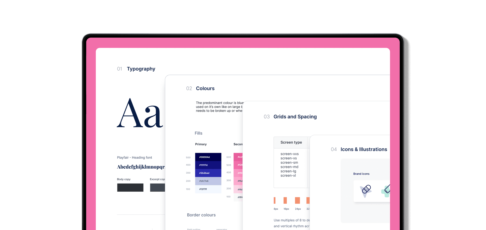
Design Tokens
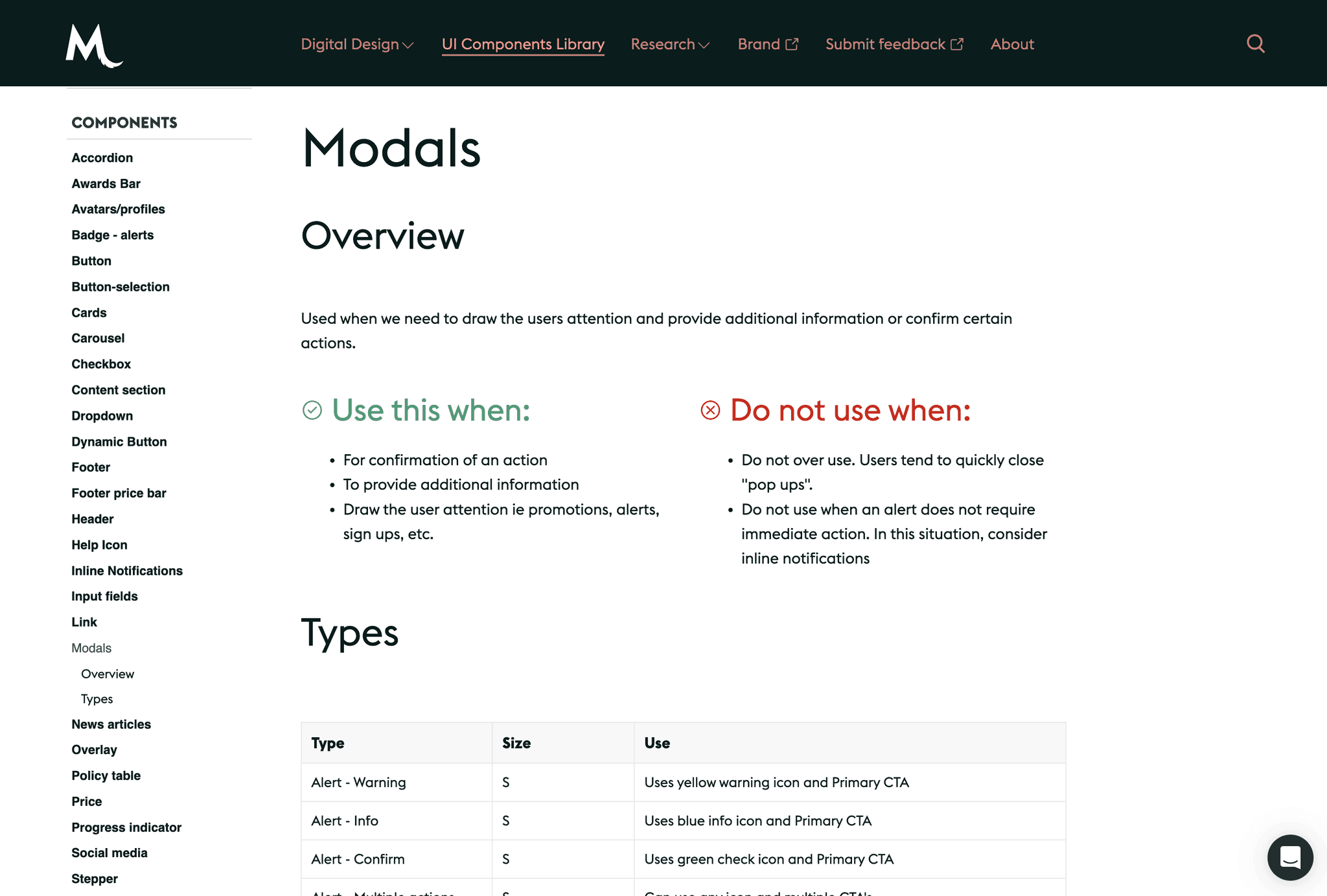
UI Components
Documentation
Figma UI Kit
Timeframe
2 years
My role and the outcome
In the beginning I defined most of the UI patterns and digital branding and later on by collaborating with two other designers and developers from each of our squads, we managed to launch the final version of the design system. Here are some of my contributions:
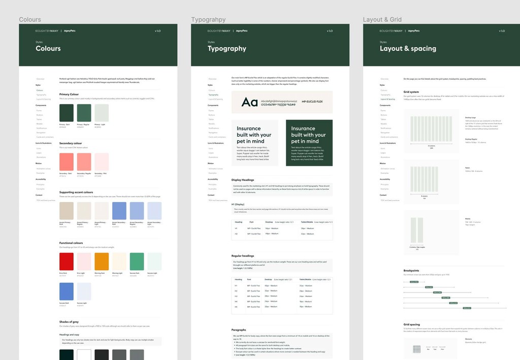
Developed a Figma style guide for designers
Helped launch the Unpack Design system that is used across the business
Defined the digital brand application (colour usage, type scale and colour ratios)
Defined processes and wrote component documentation
My approach
01
Moodboarding with marketing
02
Defining RGB colours and ratios
03
Defining the type scale and grids
04
Aligning on tokens and taxonomy
05
Building the initial UI patterns
Context and challenges
The starting point of the new design system was when ManyPets was going to be launched in the US. Because marketing was developing the print/social side of the brand I was tasked to come up with the digital approach for it. Here are some of the challenges I faced:
Branding was not finalised
The branding was not finished while I was designing the new checkout and web flows so I had to agree on an MVP approach to the UI so that I can move ahead without being blocked
Constant changes
The colours and typography changed two times while I was working on this project
Digital brand application was omitted
The application for the digital branding was not considered so the branding and colours worked well on social or print but not so well on web
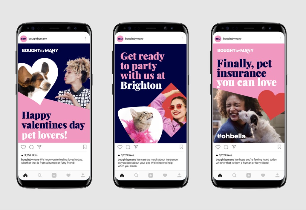
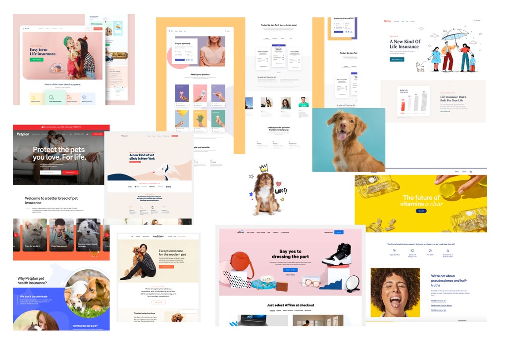
Moodboarding
In order to get a sense of where the digital style could fit with the initial branding at the time, I carried out a short mood boarding session with the marketing department. I tried to align on the following:
Define overall look and feel
Align on the image usage and illustrations
Align on the main CTA colour, ratios and contrast
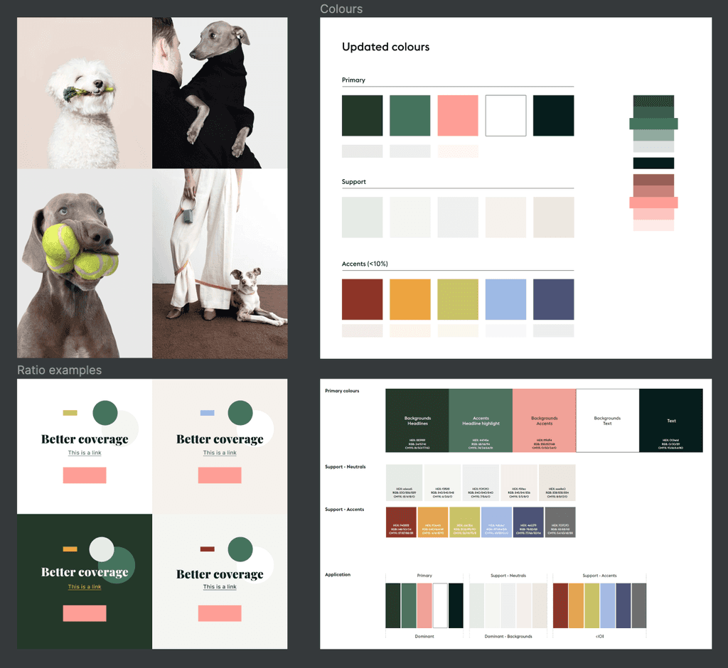
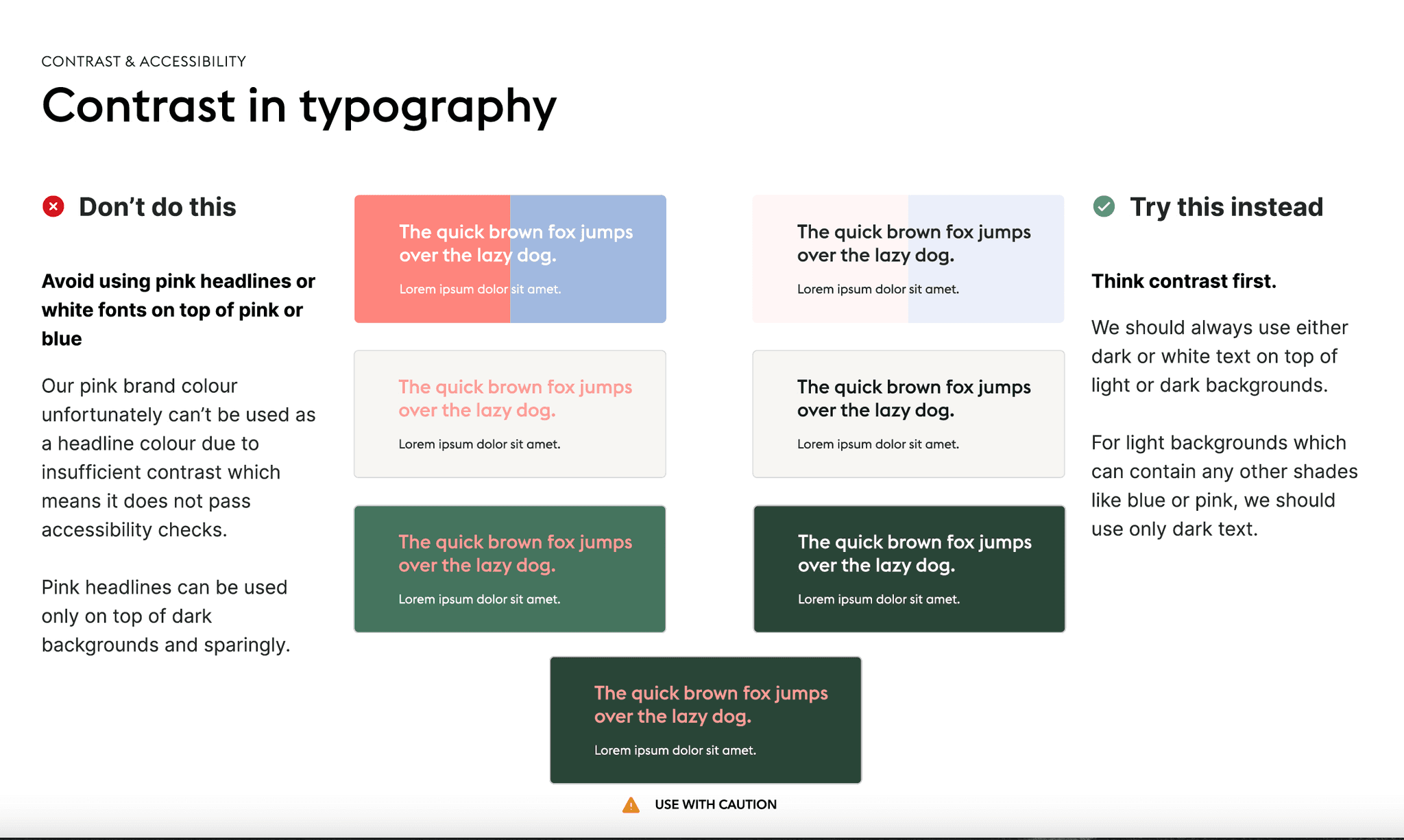
Defining the RGB colour values
and ratios
This was an important step as the brand colours were developed by focusing on CMYK colour values, so I had to tweak the main brand colours so that they can align with contrast and accessibility best practices.
Defining the colour ratios was also important as it allowed me to determine how much colour I can apply to the overall UI. I used the 60/30/10 rule in this case.
Launching the new patterns and
the V2 Design System
In order to launch on time I had to define a lot of the new patterns quite quickly so we could finish in time for the launch. Due to the time constraints, we managed to get the basics down while any interaction design and other details were left for future iterations.
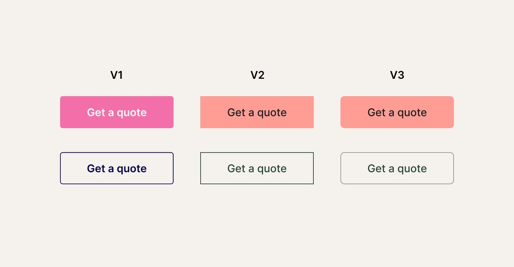
Button evolution
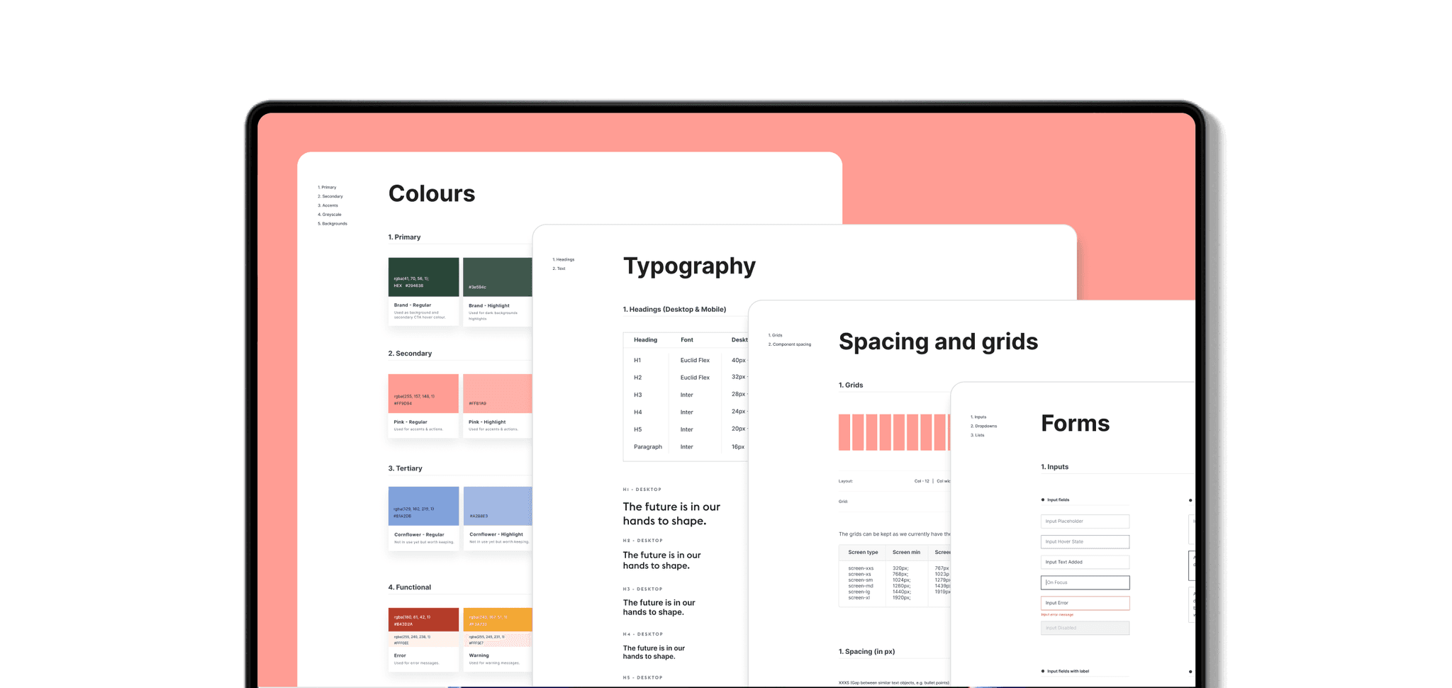
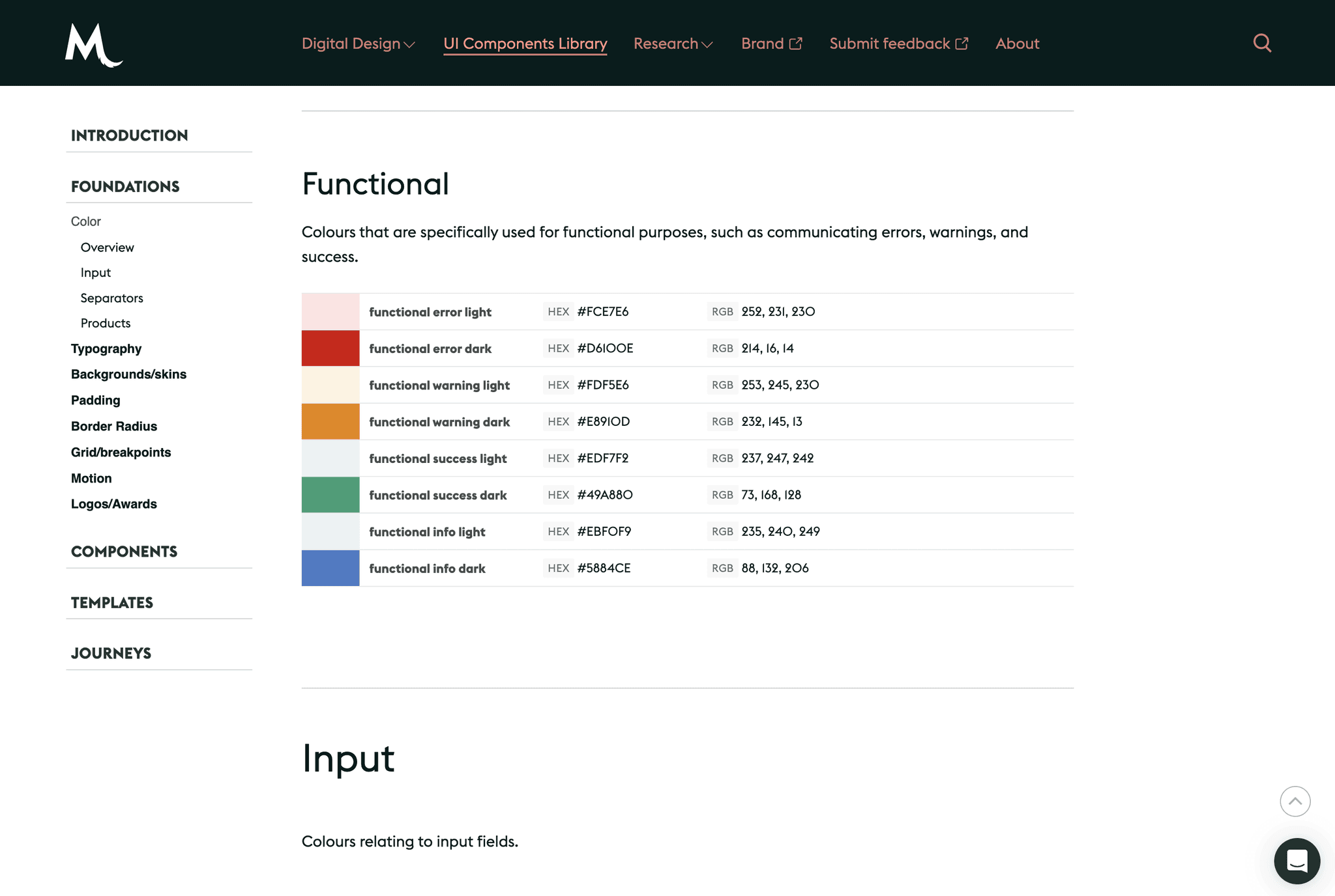
Final version of the design system
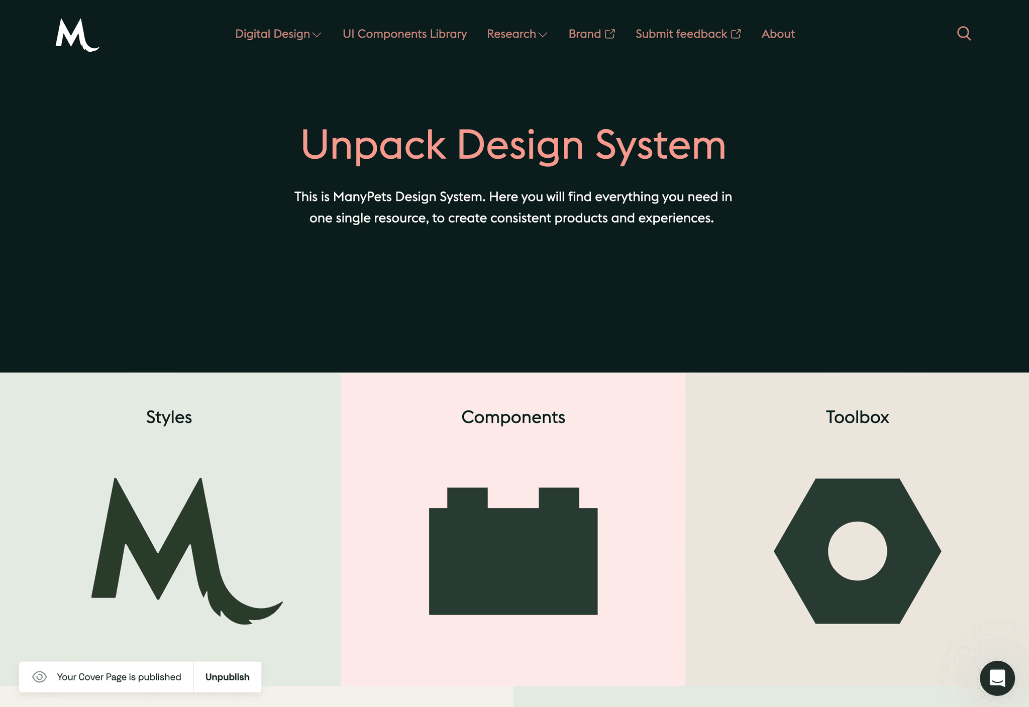
After more than two years since the design system launched I worked together with one of the senior product designers in my team to officially launch a front-end view of all of our components and digital design guidelines into Frontify which allowed everyone in our company to see and use our design system.
The design system is called Unpack and it’s now being used my multiple squads spanned across the business and it’s being updated all of the time.
📝 Key takeaways
Impact
the impact of building the design system spanned accross the company and we had great feedback from developers saying that it was much easier to maintain and build new pages through this design system
the design system also helped other teams in the company be more aware of the digital guidelines and accessibility
Success metrics:
we had an average NPS score of 80/100 which was really great
by building common reusable components, the build times of certain pages or flows was cut down significantly
Learnings:
building a design system is a team sport (if it’s not used it will eventually fail) so it’s important to get buy in from multiple key parts of the business in order to make it successful
when building components, always think of the end user but also how you can save time for the developers

Related project
Defining processes around shipping new components and changing existing ones
This was also one of the challenges we faced while building the design system. There were some developers that were afraid to change components just so that we don't need to modify them across the board and involve other squads.
To alleviate this problem I helped define:
which components are local and which ones are global
defining processes on how to amend live components
defining a process on how to test new components without adding them to the design system
Building the first version of the digital branding and the Figma UI Kit
At the beginning I designed the UI with by using the initial fonts and colours approved by the marketing team. Soon after, a revamped take on the branding was agreed on with much more muted colours and I had to design a version two of the style guide.
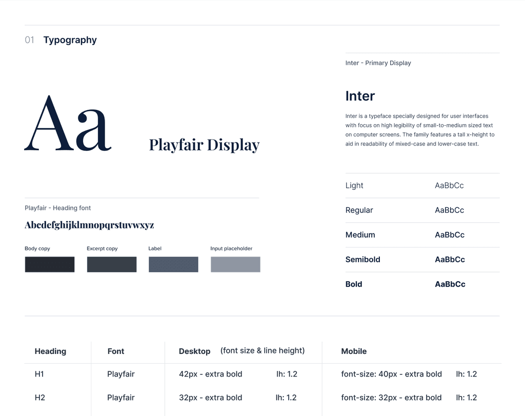
Defining the type scale and
grid system
Defining the typography was a challenge as well as marketing wanted to use big and bold heading sizes but from a usability and conversion standpoint I wanted the UI to first of all feel functional and easy to use above all.
In the end I implemented a Display font size for the web pages and the rest of the headings kept a H1 to H5 scale at a 1.2 (Minor third) scale.