
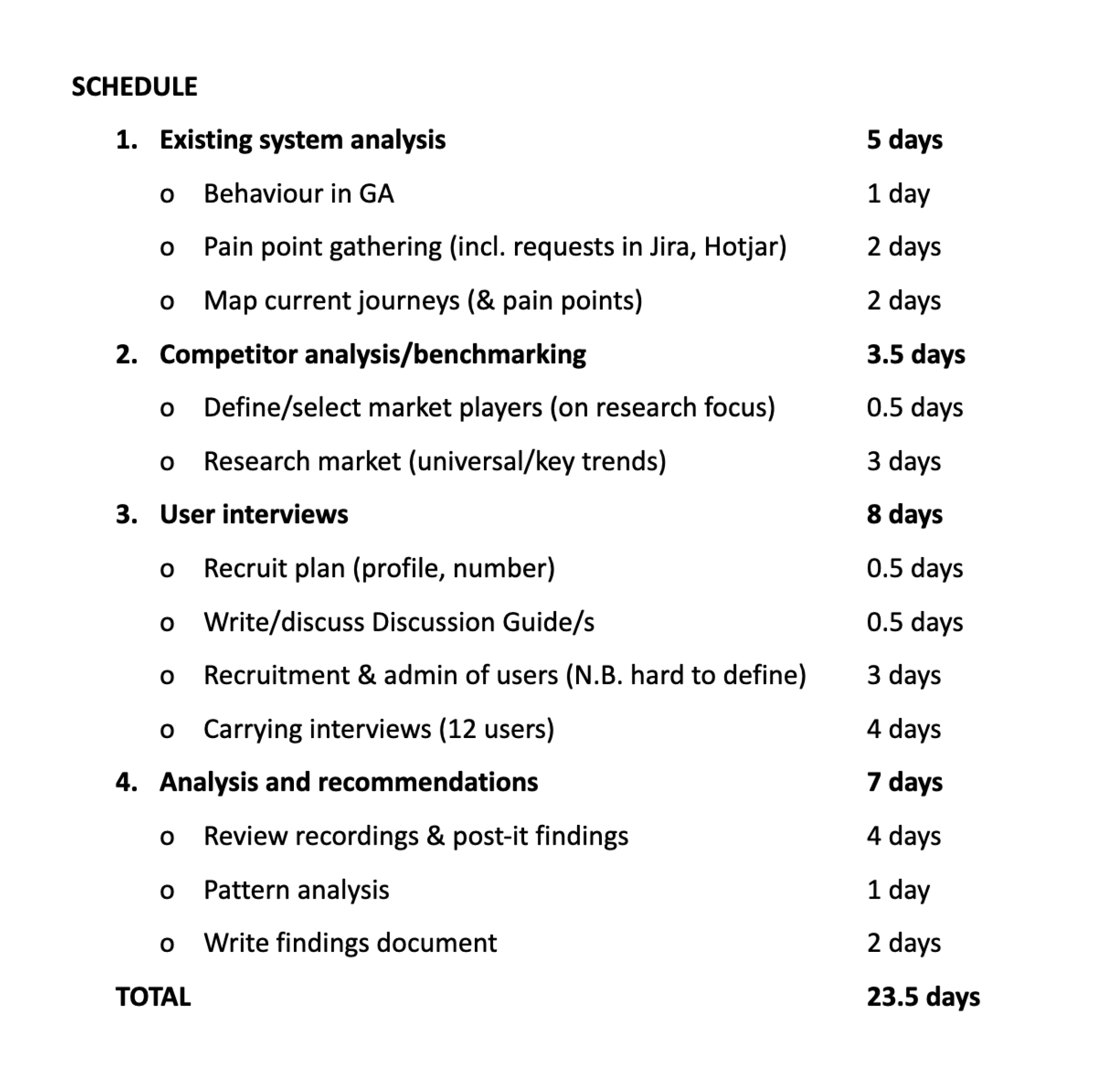
Prioritising issues
After defining the common themes, I prioritised the usability issues in AirTable in order of criticality, impact and frequency. This is also known as the severity framework.
Task criticality - how important is the task to the user? (1 = low, 5 = critical)
Impact - how much of an impact does this issue have on the user's task? (1 = suggestion, 5 = blocker)
Frequency (%) - how many times does this come up out of total participants?
Discovery overview
Together with the senior designer I conducted a combination of generative and evaluative user research to understand their needs and pain points. This was crucial to discover the context of the challenges our users were facing.
Gelato Globe redesign
Gelato serves as a worldwide on-demand print service assisting B2B clients in locally printing materials, resulting in reduced expenses and carbon emissions.
The principal aim of this project was to uncover usability challenges within a complex checkout process and enhance the user experience. This process also encompassed a complete UI revamp for the whole platform, emphasising on quality of life upgrades such as superior navigation and improved dashboard data visualisations.
Contribution
UX Research
UI/UX Design
Info. Architecture
Timeframe
6 months
Mapping current journeys and doing a quick UX audit
To understand how the flows work and what the problems might be I carried out a UX audit and mapped out the current user flows.
Besides this I also sent out a System Usability Score (SUS) survey to a few of our customers to quickly measure the usability of the platform. The result was a disappointing but expected 25/100.
User interviews
I carried out 10 moderated user interviews with our core users, the marketing/communication managers, which ordered all the materials from their individual company asset libraries. These were usually set up by their designers or an admin who constantly uploaded new materials to the library.

Defining the problems to solve
Before going into the solution phase, I defined the success metrics based on outcomes together with our Product Manager which allowed us to keep focused and track if our solutions created the right impact.
🚀 Success metrics
design a streamlined checkout journey where customers can easily order single or multi-location products while minimising time to completion
help customers deliver their orders in advance and more accurately to their destinations
refresh the UI and increase user’s confidence in using the platform
aim for a SUS score of over 60
Research findings
The checkout didn’t instil confidence due to inconsistent UI layouts, unexpected interactions and confusing information architecture
8/10 users struggled to move around the checkout due to the difficulty of navigating between different parts of the flow, often finding themselves in a step within a step, making the whole experience cumbersome and confusing
Users had to work twice as hard when ordering items because of the flow separation between single location delivery and multi location delivery (average TTC for a simple order was close to the 2 minute mark)
We identified the need for scheduled delivery and the ability to add delivery comments for scenarios such as sending items to an event venue at a specific date and time
Users lacked important features such as payment request or currency switcher


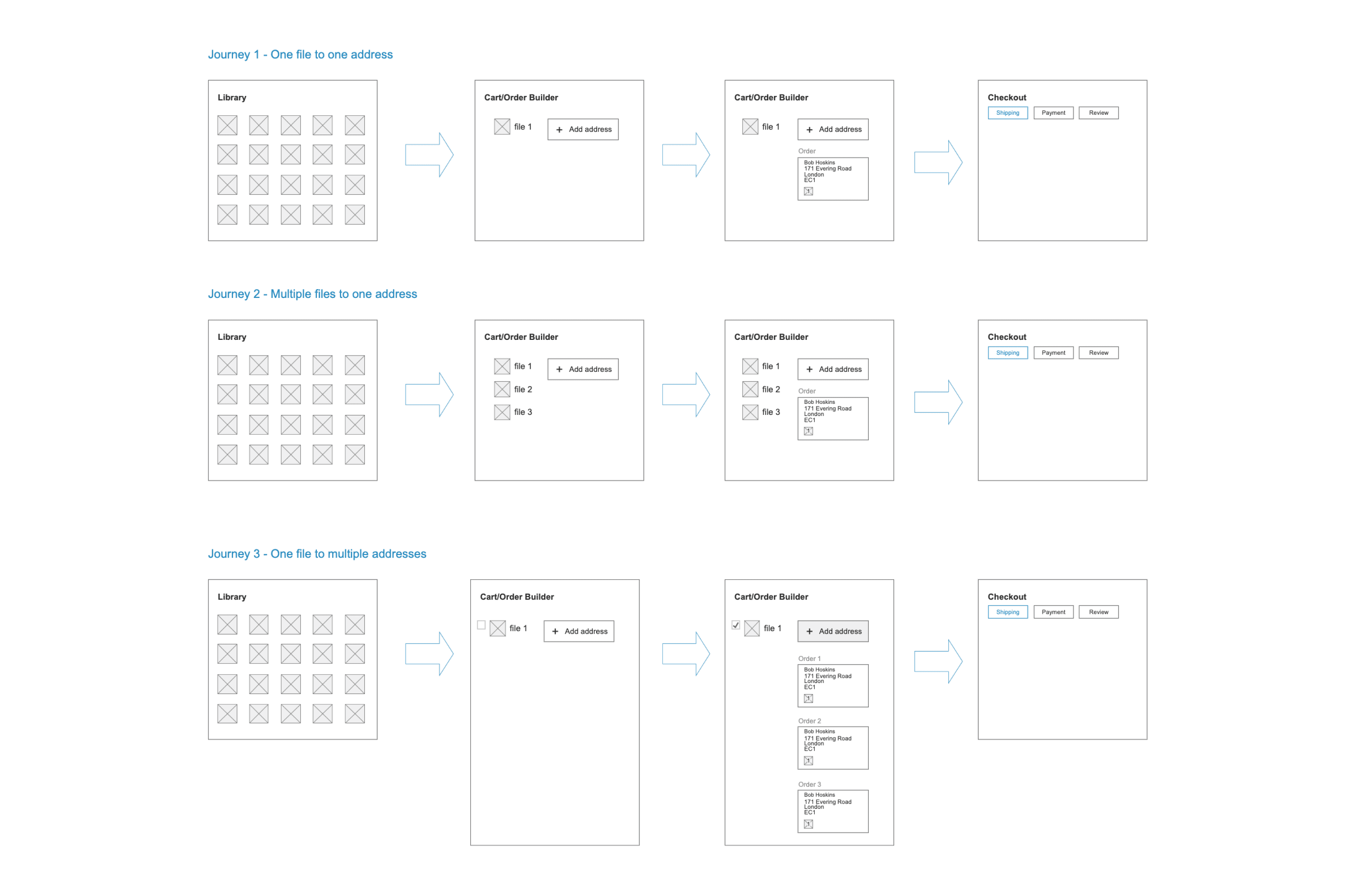
The main user journeys
Untangling complexity through collaboration
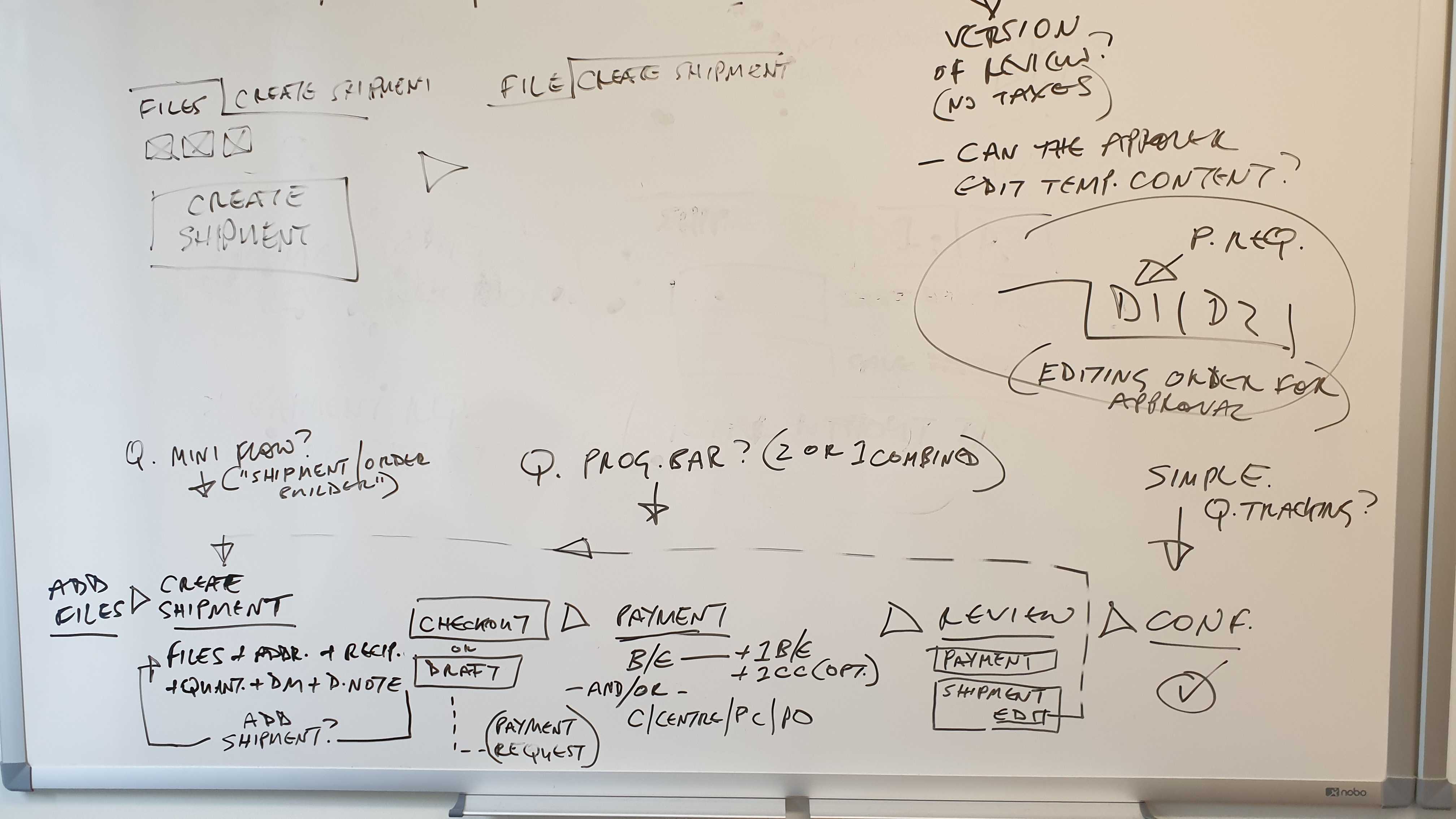
Based on the problems identified above, me and part of the London team met with the Ukraine based developers in Talinn where we had a week-long brainstorming session in order to come up with some initial solutions.
The brainstorming sessions allowed me to design the solution by taking into consideration the logistics and the complexities of printing different types of products, with different weights and amounts while being able to send them to different addresses across the globe.

✈️

Initial wireframes and user flows
The first step I took after we came back is to map out the user flows and create improved versions. From there I started mapping out the shipment building aspect and then went into wireframing potential solutions.
Final designs and hand-off
After finishing off the checkout designs, I decided to push for a redesign of the menu and library as well in order to achieve a consistent look across the main platform touch points. This involved a lot of backwards and forwards with the front-end developers which helped bring these ideas to life.
Validating the designs
I conducted an early usability testing session with the help of an InVision prototype in order to validate whether the new designs would solve our user’s problems. I wrote a user testing script asking the users to create a new order which contained multiple files and which they needed to dispatch to two different addresses.
Prototype can be accessed here
💡
The usability session revealed that it was less arduous to build orders but there were still some issues around the placement of file quantities.

Library

Cart

🏁 Results
Here are some key results after the project has ended:
The TTC decreased dramatically from 2 minutes to around 40 seconds on average.
We managed to improve the System Usability Scale (SUS) through the various UX and UI improvements from 25 to 77.5.
The total number of orders through the platform also increased by 8% following the update
Through the new updates, the checkout was much easier to iterate upon, setting a strong foundation from a UI and UX standpoint for future improvements.


📝 Key takeaways
Seek other people’s expertise and get to know who the main stakeholders are from the beginning so it's easier to manage the complexity and understand the different parts of the user experience.
Collaborating and including developers early in the design process proved to be very important as it streamlined the way we found the right solutions
Don’t be afraid to try something new. In this case using Figma as our new design tool along side usertesting.com.
Design system overview
While working on this project I liaised with our developers to create new components and declare states and styling for each one that was used in the redesign. This involved defining new UI patterns by going through a simple mood-boarding and digital branding process which helped me steer the styling better.
The whole UI Kit can be previewed here.


Beta live preview & testing
After designing an InVision prototype and testing with users before launch, we moved the new checkout into beta and released it to a few customers. This allowed us to iron out the last few details and be confident that we achieved all of our success metrics.
Single shipment

Multi shipment


Related project

01
Multiple hidden steps within a step creating unnecessary clicks
02
The shipping and quantities are split up but should be on the same step
03
Separated flows for single and multi location orders is confusing
Issues with the existing user flow
“Would be nice if I could see my recently used addresses/recipients”
Andreas - Rommelag
“It’s really hard to do multi-location orders. I keep getting confused how to do it, but I figure it out eventually”
Jean Baptiste - Delachaux
“I would love to book ahead so I can do the ordering all at once without rushing at the last minute.
Keren - Kenes


Background
I joined Gelato as the second product designer in the company alongside a team of remote developers from Ukraine and a London based PM where I was responsible for improving the UX and UI across key parts of the digital asset management system and purchasing flow.
The challenge
The checkout and overall platform UI looked outdated and felt cumbersome to use so me and the product team were tasked to redesign the entire experience. While most customers developed work-arounds in order to use the product effectively, quite a few expressed the need for extra features and better ways of managing single or multi location orders.

The initial dashboard styling when I joined Gelato
Improved dashboard data visualisation
Besides improving the main checkout flow I wanted to update the menu IA and styling along side better data visualisation so that Account Managers can sell the product much easier. This was launched right after the checkout redesign was completed.
