Gelato print-on-demand platform redesign

Gelato is a global B2B on-demand print platform that lets businesses order branded materials printed locally at their destination, cutting delivery costs and carbon emissions.

I joined as the second product designer, working with a London-based PM and a remote development team in Ukraine.

The goal was to make the checkout fast and reliable enough that customers stopped needing workarounds, and to modernise the overall look and feel in order to make the plaftorm more marketable.

Company type

B2B SaaS, Scale-up

Time frame

6 months

Contribution

Research, Service Design, UI Design, Design System

+8%

+8%

Platform order volume post-launch

Peak conversion rate

25 โ†’ 77.5

25 โ†’ 77.5

SUS Score, exceeding good threshold

SUS Score, exceeding good threshold

3x faster

3x faster

on average for multi location orders

on average for multi location orders

THE PROBLEM

A platform customers had learned to work around, not with.

A platform customers had learned to work around, not with.

Gelato's checkout had grown organically and it showed. Most customers had built their own workarounds just to get through a standard order. The brief was to fix the checkout, but it quickly became clear the whole platform UI needed to move at the same time.

THE USER

8 of 10 users regularly got lost mid-checkout. The IA had no clear way back from sub-sections. Users ended up in a step within a step with no obvious exit, often restarting from scratch.

PRODUCT

Single and multi-location orders were completely separate flows. Customers ordering to multiple addresses had to switch modes entirely, essentially completing the order twice. The two flows shared no components or state.

BUSINESS

The platform UI had fallen behind its own complexity. Missing features like saved addresses, delivery notes, and scheduled ordering meant customers were relying on manual workarounds that didn't scale as order volumes grew.

THE USER

No frame of reference for the product. US pet owners were not used with the concept of pet insurance but rather pet wellness products. The flow had to educate and convert at the same time, without adding friction.

PRODUCT

The UK product couldn't simply be copied. User behaviour, terminology, and expectations were genuinely different. Everything had to be researched and designed from scratch.

BUSINESS

ManyPets was going through a transformation, changing it's name from BoughtByMany in order to appeal more to the US customer. This meant that the new branding was developed along side the new flows which made the process more complicated.

DISCOVERY

Starting with a number that made the case for the project.

Starting with a number that made the case for the project.

Before any interviews or flows, I sent a System Usability Scale survey to a sample of customers.

The score came back at 25/100. That's not just "needs improvement". It's a platform that most users find genuinely difficult to use. It also gave us an objective baseline to measure against when we shipped.

SUS survey

Sent to a sample of active customers before any design work. Established a measurable baseline and made the case for the project internally.

UX audit

Mapped all current user flows to understand the existing architecture and identify structural problems before running interviews.

10 moderated interviews

Spoke with marketing and communications managers (the core user group) plus customer success and the data team for a complete view of where the platform was failing.

Cross-functional input

Talked with developers and account managers early on to understand the physics of multi-location print (weight, parcel splits, delivery windows), other core issues and logistics constraints before designing any solution.

THE USER

No frame of reference for the product. US pet owners were not used with the concept of pet insurance but rather pet wellness products. The flow had to educate and convert at the same time, without adding friction.

PRODUCT

The UK product couldn't simply be copied. User behaviour, terminology, and expectations were genuinely different. Everything had to be researched and designed from scratch.

BUSINESS

ManyPets was going through a transformation, changing it's name from BoughtByMany in order to appeal more to the US customer. This meant that the new branding was developed along side the new flows which made the process more complicated.

USER INTERVIEWS AND FINDINGS

The problems, unfiltered

The problems, unfiltered

Speaking with users directly through moderated user testing sessions was key to uncover their main frustrations with the app and to complement the quant data we had. I also spoke with Account managers, Customer Service and Marketing to find other common themes.

Separated flows for single and multi location orders create confusion

"It's really hard to do multi-location orders. I keep getting confused how to do it, but I figure it out eventually."

Jean Baptiste ยท Delachaux

The shipping and quantities are split up but should be on the same step

"It's odd that I need to select quantities in the cart. I want to see the final price at the end not before I even start the order"

Andreas ยท Rommelag

Missing quality-of-life features users expected as standard

"I would love to book ahead so I can do the ordering all at once without rushing at the last minute."

Keren ยท Kenes

PRIORITISATION

Scoring 19 issues before designing a single solution.

Opportunities I uncovered outside my teamโ€™s area of focus

After synthesising the interviews I documented every usability issue in Airtable and scored each one across three dimensions. The severity score (criticality ร— impact ร— frequency) gave us an objective ordering. The highest-severity issues went first, regardless of which ones were easiest to design for.

DIMENSION 1

Task criticality

How important is this task to the user's core job? Scored 1 (low) to 5 (critical). Multi-location ordering scored 5, the primary use case for most customers.

DIMENSION 2

Impact on user

How much does this issue affect the user's ability to complete the task? 1 (suggestion) to 5 (full blocker). Navigation issues scored 4โ€“5 across the board.

DIMENSION 3

Frequency

What percentage of participants encountered this issue? Issues affecting 70%+ of users were treated as must-solve for the MVP, regardless of their other scores.

DEFINITION

Desired outcomes set
before any design started

Besides the SUS baseline, I signed off the core success metrics with Product and Engineering before we started looking for a solution.

Success metrics and UX goals
  • Order volume increased by at least 5%

  • Decrease TTC by at least 67%

  • SUS Score above 60

  • Implement new features such as scheduled delivery, smart defaults for recipient addresses and delivery notes

  • Improve the overal look and feel of the platform by updating the UI style

COLLABORATION

A week in Tallinn with the engineering team.

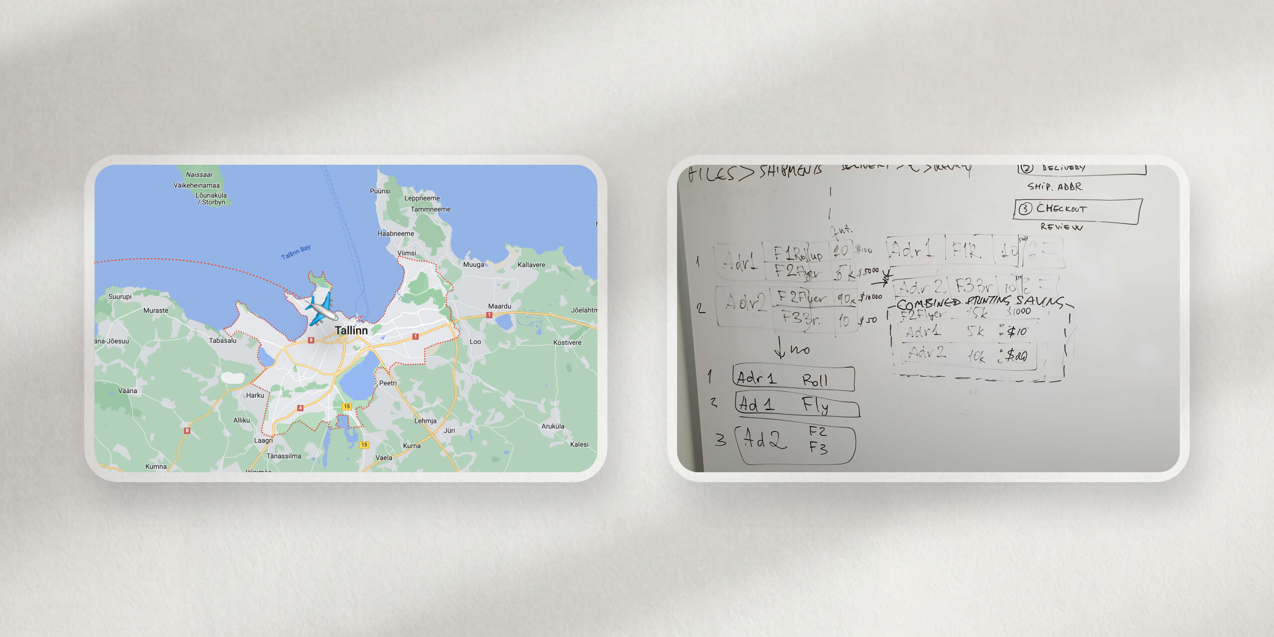
The checkout complexity (multiple files, multiple addresses, variable parcel weights, international logistics) meant design couldn't happen in isolation. I flew to Tallinn with part of the London team to spend a week with the Ukraine-based developers working through solutions in person.
CONSTRAINTS IDENTIFIED

The sessions surfaced constraints that would have taken weeks to discover remotely: how the platform batched shipments, what was possible with delivery window APIs, how billing entities worked across jurisdictions.

SOLUTION ALIGNED

The result was solution alignment that let us move from wireframes to build-ready specs in weeks rather than months, with far fewer back-and-forth cycles once development started.

PROTOTYPING & TESTING

Validated before build. Iterated after launch.

Validated before build. Iterated after launch.

The solution was tested twice: once before development started, using a design Prototype, and again with the live product using the SUS survey as the measurement instrument.

ROUND 1 ยท PRE-BUILD PROTOTYPE TEST

Does the unified flow actually work for multi-location orders?

I wrote a test script around the highest-severity scenario: creating a new order with multiple files dispatched to two different addresses. This was the case most likely to break, and the one causing the most support tickets.

The flow was less arduous to complete, and users successfully created multi-location orders without switching context, although there were still questions around the file quantity being moved to the order summary page.

ROUND 2 ยท POST-LAUNCH SUS MEASUREMENT

SUS: 25 โ†’ 77.5. Target: 60. Exceeded by 17.5 points.

After launch, I re-ran the SUS survey with the same customer base. The standardised format meant the scores were directly comparable. No interpretation needed. The improvement was unambiguous.

+52.5-point SUS uplift, from 25 to 77.5. That moved the platform out of the bottom 10% of software measured and into the "good" band of the SUS scale.

ROUND 1 ยท PRE-BUILD PROTOTYPE TEST

Does the unified flow actually work for multi-location orders?

I wrote a test script around the highest-severity scenario: creating a new order with multiple files dispatched to two different addresses. This was the case most likely to break, and the one causing the most support tickets.

The flow was less arduous to complete, and users successfully created multi-location orders without switching context, although there were still questions around the file quantity being moved to the order summary page.

ROUND 2 ยท POST-LAUNCH SUS MEASUREMENT

SUS: 25 โ†’ 77.5. Target: 60. Exceeded by 17.5 points.

After launch, I re-ran the SUS survey with the same customer base. The standardised format meant the scores were directly comparable. No interpretation needed. The improvement was unambiguous.

+52.5-point SUS uplift, from 25 to 77.5. That moved the platform out of the bottom 10% of software measured and into the "good" band of the SUS scale.

SOLUTIONS

Before and after: four key areas redesigned

Before and after: four key areas redesigned

Delivering the new solution and styling came with frequent syncs with developers and a close collaboration with one of the front end developers who helped me find the right technical approach to the new styling implementation.

BEFORE

Old file library

BEFORE

Old file library

AFTER

Consistent nav, improved filtering and clear file states

AFTER

Consistent nav, improved filtering and clear file states

BEFORE

Cart

BEFORE

Cart

AFTER

Cart with cleaner file list, print spec visible, consistent with checkout

AFTER

Cart with cleaner file list, print spec visible, consistent with checkout

CORE SOLUTION

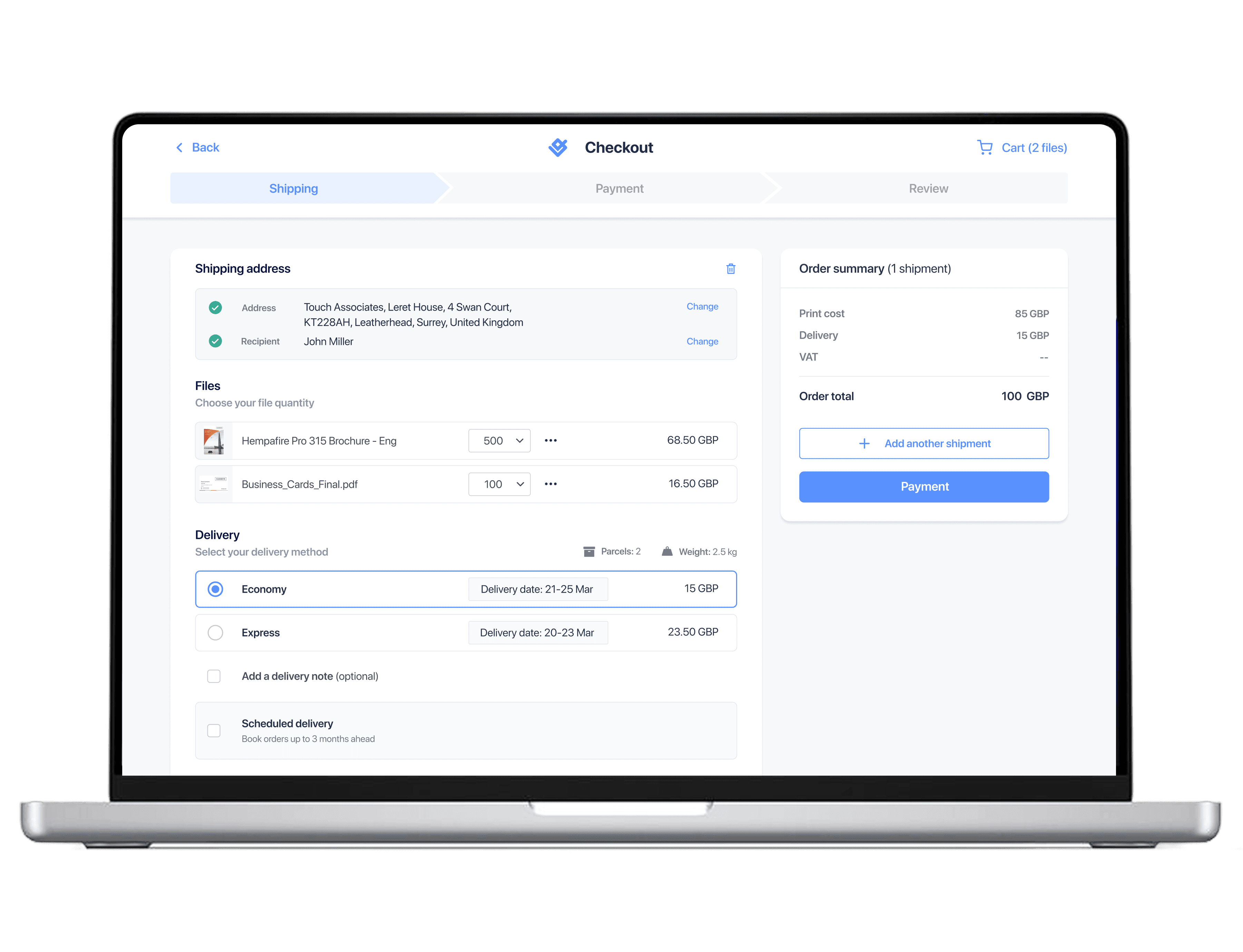
Unified checkout, single flow for single and multi-location orders. Address, files, delivery and summary on one page. Scheduled delivery as a native option.

CORE SOLUTION

Unified checkout, single flow for single and multi-location orders. Address, files, delivery and summary on one page. Scheduled delivery as a native option.

OUTCOMES

Every metric hit.
Every target exceeded.

Every metric hit.
Every target exceeded.

The redesign didn't just fix the checkout. It created a scalable platform foundation that made every future iteration faster to ship.

+8%

Relative conversion rate improvement

Overal funnel conversion increase from 13.2% to 16.4%

+8%

Relative conversion rate improvement

Overal funnel conversion increase from 13.2% to 16.4%

~2m

Multi-location order time ยท estimated

From ~6 min (est.) ยท ~3ร— faster

~2m

Multi-location order time ยท estimated

From ~6 min (est.) ยท ~3ร— faster

77.5

SUS score

From 25 ยท Target was 60 ยท Exceeded by 17.5pts

77.5

SUS score

From 25 ยท Target was 60 ยท Exceeded by 17.5pts

DESIGN SYSTEM FOUNDATIONS

A lightweight UI kit and built alongside the product

I built components as they were needed for the redesign, defining states, interactions, and styling patterns iteratively with the front-end developers. The result was a practical, immediately usable kit which served as a starting point for a full design system

WHAT I LEARNED

Complexity is easily solved through close collaboration

Complexity is easily solved through close collaboration

The Tallinn trip wasn't a nice-to-have, it was why the solution worked. The realities of a global print platform (parcel weights, delivery APIs, billing across countries) don't show up in a research report. You only see them in the same room as the people who built the systems. Complex B2B design can't happen alone.

The SUS survey showed me the value of one clear number over gut feel. When we shipped, there was no debate about whether it was better, the score said so. It also helped sell the project at the start and report results at the end.

The severity framework was the other thing that helped. Sorting by evidence, not by who argued loudest, meant we fixed what users actually struggled with first.

Doing the market research before touching Figma was the best call on this project. Because we understood US users and their context before we built for them, we had very few structural fixes post-launch. We spent that time on improvements instead of corrections.

The personalisation round taught me something I hadn't expected. Adding the city skyline, breed icons, and condition-specific copy moved conversion from 5% to 12%. Not because the flow worked better functionally โ€” it already did. Because users felt like the product was built for them specifically. In a category where trust is hard to earn, that matters more than most things.