ManyPets Checkout Redesign

ManyPets is an award-winning pet insurance company operating in the UK, Sweden, and the US, offering comprehensive cover with unlimited vet fee reimbursement.

I was the sole designer on this project, working with a PM, a Director of Growth, and a team of London-based developers.

The goal was to design the quote and buy flow from scratch for the US market launch and hit profitability within the first year.

Company type

Insurtech, Scale-up

Time frame

6โ€“7 months to launch ยท 1+ year iteration

Contribution

UX Research, Prototyping, 0 to 1 Product Design, Design System

1. Pet details

2. Price

3. Enroll

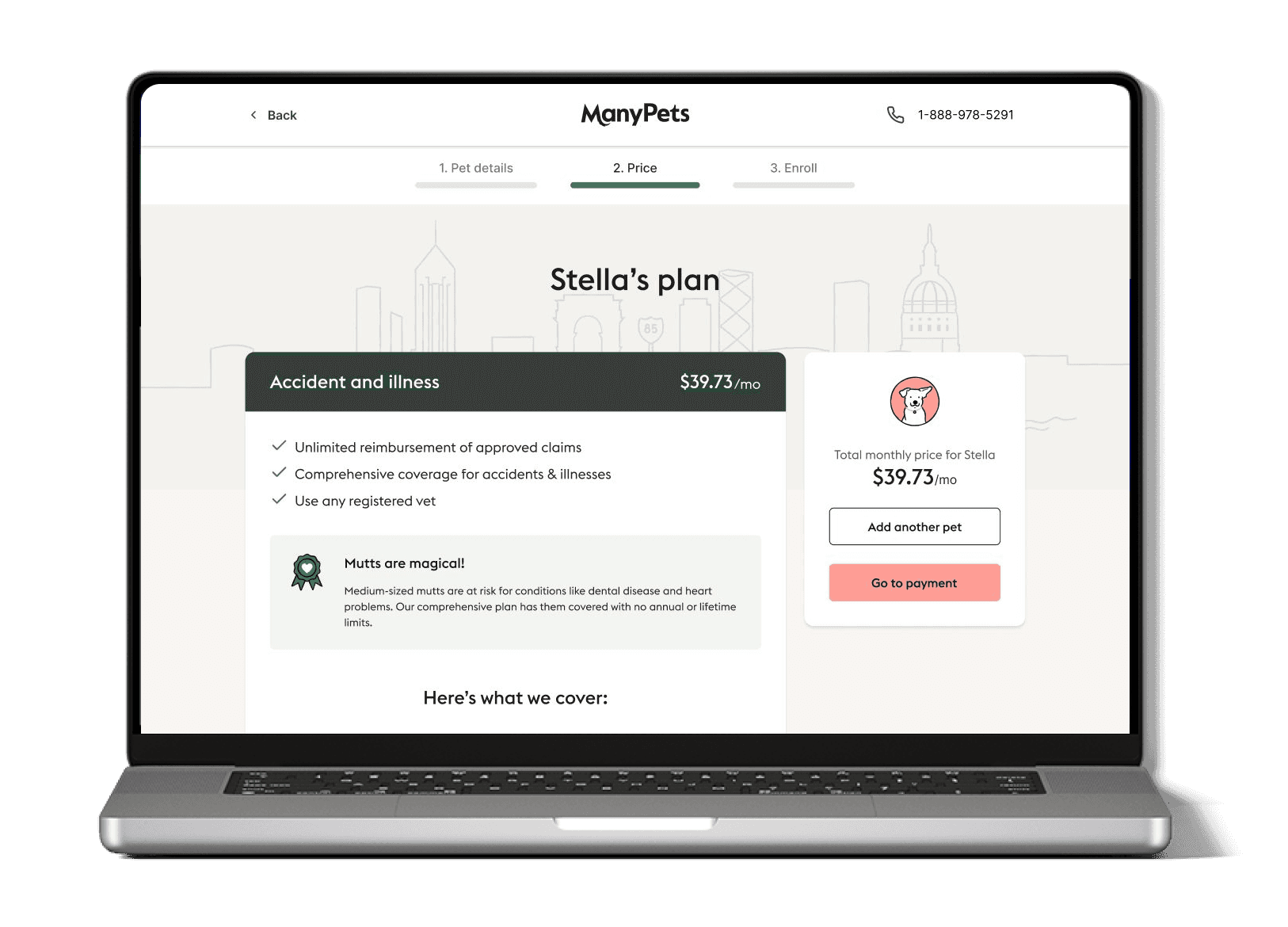
Stellaโ€™s plan

Total monthly price for Stella

$39.73

/mo

Accident & illness

$39.73

/mo

Unlimited reimbursement of approved claims

Comprehensive coverage for accidents & illnesses

Use any registered vet

Mutts are magical!

And because they often suffer from [breed condition], we make sure our unlimited vet fee coverage caters for any eventuality.

Hereโ€™s what we cover:

Unexpected accidents or illnesses

Digestive issues, cancer, diabetes, fractures, dental, genetic conditions, conditions from birth, and everything in between

Exams & tests

Blood tests, X-rays, MRIโ€™s, ultrasounds, CT-scans, urinalysis, and more

Medications

Any vet-prescribed meds

Treatments & surgeries

All vet-approved surgical procedures and treatments (incl. rehabilitation, acupuncture or chiropractic treatment)

Hospitalizations

In-patient, outpatient, speciality, and emergency stays

Vet visits

No in-network restrictions. We cover bills from any licensed-vet you choose

Also good to know

Pre-existing conditions

We cover pre-existing conditions if your pet has been symptom and treatment-free for 18 months

Preventive & wellness

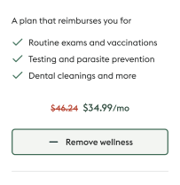
This product doesnโ€™t cover routine or preventive care โ€” but you can add our wellness plan below

Waiting period

Weโ€™ll start covering accident or illness claims 15 days after the start of your policy (unless you can show you held insurance 24hrs prior to joining ManyPets)

Whatโ€™s not covered

We don't cover spaying and neutering or cosmetic treatments

See full policy details

Customize your plan

Your reimbursement:

90%

80%

70%

most popular

Your annual deductible:

$100

$250

$500

most popular

Example based on your selection

If Rocky had an accident:

Keep Stella healthy

Discount applied

Wellness

$34.99

/mo

Add another pet

Continue

Paid in 3 easy steps

Pay the vet (any vet)

Send us the invoice

Get reimbursed

1. Pet details

2. Price

3. Enroll

Stellaโ€™s plan

Total monthly price for Stella

$39.73

/mo

Accident & illness

$39.73

/mo

Unlimited reimbursement of approved claims

Comprehensive coverage for accidents & illnesses

Use any registered vet

Mutts are magical!

And because they often suffer from [breed condition], we make sure our unlimited vet fee coverage caters for any eventuality.

Hereโ€™s what we cover:

Unexpected accidents or illnesses

Digestive issues, cancer, diabetes, fractures, dental, genetic conditions, conditions from birth, and everything in between

Exams & tests

Blood tests, X-rays, MRIโ€™s, ultrasounds, CT-scans, urinalysis, and more

Medications

Any vet-prescribed meds

Treatments & surgeries

All vet-approved surgical procedures and treatments (incl. rehabilitation, acupuncture or chiropractic treatment)

Hospitalizations

In-patient, outpatient, speciality, and emergency stays

Vet visits

No in-network restrictions. We cover bills from any licensed-vet you choose

Also good to know

Pre-existing conditions

We cover pre-existing conditions if your pet has been symptom and treatment-free for 18 months

Preventive & wellness

This product doesnโ€™t cover routine or preventive care โ€” but you can add our wellness plan below

Waiting period

Weโ€™ll start covering accident or illness claims 15 days after the start of your policy (unless you can show you held insurance 24hrs prior to joining ManyPets)

Whatโ€™s not covered

We don't cover spaying and neutering or cosmetic treatments

See full policy details

Customize your plan

Your reimbursement:

90%

80%

70%

most popular

Your annual deductible:

$100

$250

$500

most popular

Example based on your selection

If Rocky had an accident:

Keep Stella healthy

Discount applied

Wellness

$34.99

/mo

Add another pet

Continue

Paid in 3 easy steps

Pay the vet (any vet)

Send us the invoice

Get reimbursed

14.8%

14.8%

Peak conversion rate - 196% above average

Peak conversion rate - 196% above average

5% โ†’ 12%

5% โ†’ 12%

Conversion uplift from personalization

Conversion uplift from personalization

7 figures

7 figures

Revenue in year one

Revenue in year one

3 markets

3 markets

Blueprint adopted in the US, Sweden and UK

Blueprint adopted in the US, Sweden and UK

THE CHALLENGE

Designing a pet insurance product for an up-and-coming market.

Designing a pet insurance product for an up-and-coming market.

The US pet insurance market was small and most consumers had never considered buying it. Designing a quote and buy flow for a product your users don't fully grasp yet was a fundamentally different problem to optimising an existing one.

THE USER

No frame of reference for the product. US pet owners were not used with the concept of pet insurance but rather pet wellness products. The flow had to educate and convert at the same time, without adding friction.

PRODUCT

The UK product couldn't simply be copied. User behaviour, terminology, and expectations were genuinely different. Everything had to be researched and designed from scratch.

BUSINESS

ManyPets was going through a transformation, changing it's name from BoughtByMany in order to appeal more to the US customer. This meant that the new branding was developed along side the new flows which made the process more complicated.

THE USER

No frame of reference for the product. US pet owners were not used with the concept of pet insurance but rather pet wellness products. The flow had to educate and convert at the same time, without adding friction.

PRODUCT

The UK product couldn't simply be copied. User behaviour, terminology, and expectations were genuinely different. Everything had to be researched and designed from scratch.

BUSINESS

ManyPets was going through a transformation, changing it's name from BoughtByMany in order to appeal more to the US customer. This meant that the new branding was developed along side the new flows which made the process more complicated.

RESEARCH - PART 1 of 3

Understanding the new market and the context of our users

Understanding the new market and the context of our users

We collaborated with a Market Research firm where I was actively included into the debriefing meetings where I could learn more about the insurance landscape in the US and types of users we were targeting.

The segmentation shaped every subsequent decision: messaging tone, coverage hierarchy, how we framed price, and which emotional triggers to lean into versus avoid.

RESEARCH - PART 2 of 3

Running moderated usability sessions on US competitor websites

The goal was to understand how US pet parents think about insurance from scratch, not validate our own assumptions. Almost every design decision that followed traces back to one of 3 core findings.

Research findings

01
US users prioritise coverage over price

In the UK, price is the primary decision driver. In US, participants would pay more to know their pet was fully covered, even when shown a cheaper alternative.

02
Past pet health scares are the primary purchase trigger

The single most common reason US users gave for considering insurance was a personal experience with a sick pet, or hearing about one from a friend or family member.

03
Insurance is seen as ongoing care, not emergency cover

US pet parents didn't think of insurance as something you activate when disaster strikes. This was a fundamental framing difference from UK users.

RESEARCH - PART 3 OF 3

Scoring 6 competitors across the dimensions that mattered.

Scoring 6 competitors across the dimensions that mattered.

After the user sessions I built a structured feedback analysis framework in Airtable, manually scoring each flow across the functional areas most relevant to our design decisions. Every session run by hand, before AI-assisted research was an option. The analysis confirmed the market gap and gave us a clear design benchmark.

OPPORTUNITY IDENTIFIED

No competitor solved simplicity and depth simultaneously. High-scorers (Pawprotect, Figo) were comprehensive but dense. Low-scorers were cleaner but trust-poor. The gap was a flow that did both. That was our opening.

DESIGN INPUT

Customise before committing. Every top-scoring flow showed deductible and reimbursement options before the price lock-in. This validated our quote page architecture: configure first, pay second.

SYNTHESIS

From research to a shared picture of what we were building.

From research to a shared picture of what we were building.

Before designing anything, I ran a service blueprint workshop with developers and stakeholders to map every touchpoint from first ad to post-purchase. One shared picture before anyone opened Figma.

It also caught edge cases early: users from states where we weren't live yet, mid-flow abandonment, and multi-pet scenarios.

Success metrics set before design started
  • Launch the MVP, learn and iterate after launch

  • Conversion above 5% in first 3 months (industry avg: ~10%)

  • Policies sold per week target met in months 1โ€“3

  • First-month retention tracked and baselined

  • Drop-off rate per screen identified and tracked

TESTING & ITERATION

Four rounds of evidence-led iterations

Four rounds of evidence-led iterations

Every significant design decision was validated before it shipped: through prototype testing, beta sessions, or post-launch data analysis.

ROUND 1 ยท PROTOTYPE TESTING

Testing the best IA approach. Form wins.

Created 3 modular Figma prototypes (all-in-one form, step-by-step, and hybrid progressive disclosure) and ran comparative usability testing measuring time to completion and user confidence.

8 of 10 users preferred the form layout. They could see all required fields at a glance, gauge completion time, and felt more in control. Step-by-step felt opaque. Users didn't know how long it would take.

ROUND 2 ยท PRE-LAUNCH BETA

Coverage behind a toggle doesn't work.

Before the MVP went live, I ran another round of beta testing with a near-production build. A clear pattern emerged around the quote page. Users wanted to see what they were buying before they customised it.

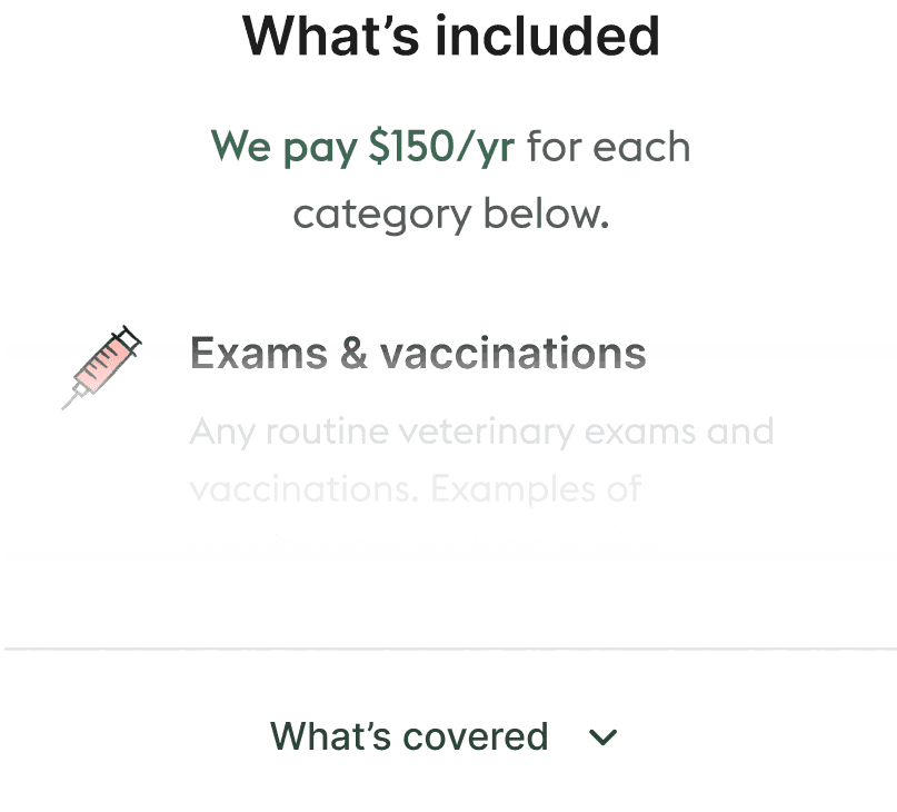
Strong preference for coverage visible upfront. Users also wanted more detail per coverage point, not just category names. This led to the expanded checklist format and category descriptions.

ROUND 3 ยท POST LAUNCH ITERATION

Personalisation: 5% โ†’ 12% conversion.

Post-launch data showed users were engaging most with the breed-specific content. I expanded this into a full personalisation layer: a city skyline illustration based on zip code, a custom illustrated icon per breed, and messaging addressing breed-specific health conditions.

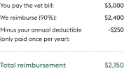
This single change drove conversion from 5% to 12%, a 140% improvement. The reimbursement calculator was added in the same iteration and was well received.

ROUND 4 ยท YEAR ONE OPTIMIZATION

Merge review + payment: 12% โ†’ 14.8%.

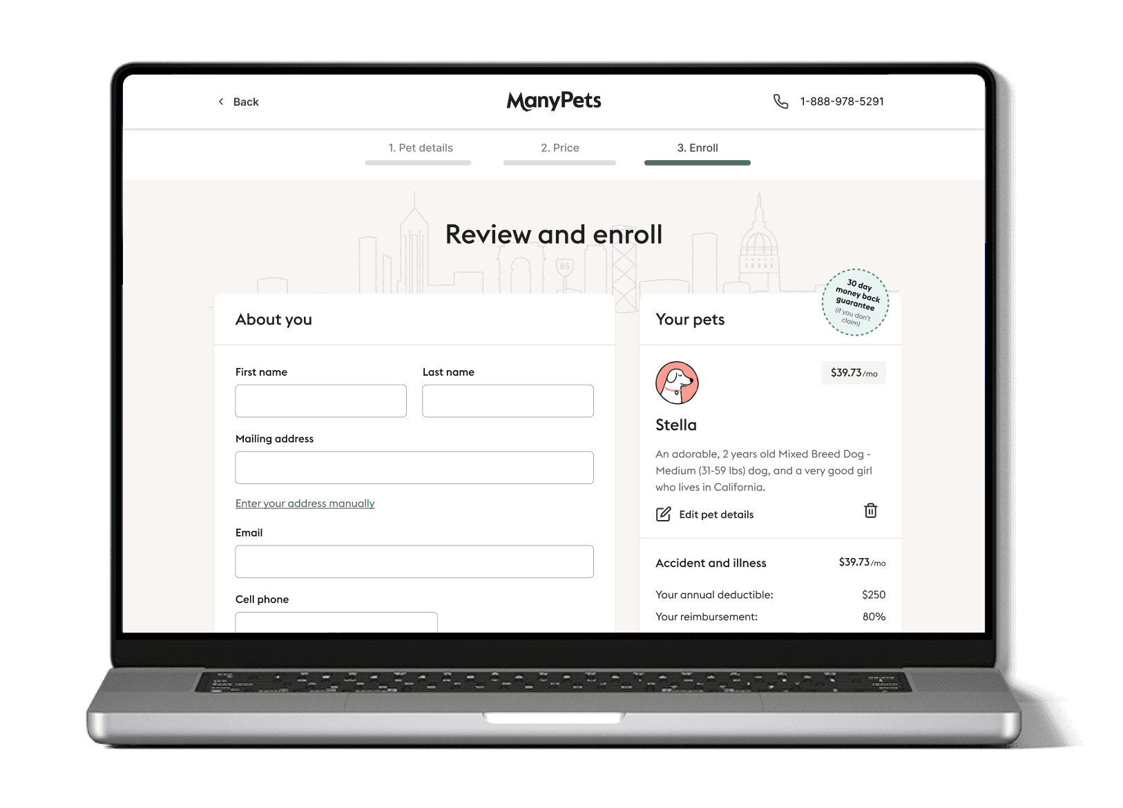
After a year of data, we had great conversion results but I felt we could do more. Users were re-reading content they'd already seen on the review page so I proposed consolidating review and payment into a single enroll screen.

Conversion hit 14.8%, an industry-leading rate, 196% above the ~5% category average, and the highest the product had ever achieved. The 3-step flow (Pet details, Price, Enroll) became the final architecture.

ROUND 1 ยท PROTOTYPE TESTING

Testing the best IA approach. Form wins.

Created 3 modular Figma prototypes (all-in-one form, step-by-step, and hybrid progressive disclosure) and ran comparative usability testing measuring time to completion and user confidence.

8 of 10 users preferred the form layout. They could see all required fields at a glance, gauge completion time, and felt more in control. Step-by-step felt opaque. Users didn't know how long it would take.

ROUND 2 ยท PRE-LAUNCH BETA

Coverage behind a toggle doesn't work.

Before the MVP went live, I ran another round of beta testing with a near-production build. A clear pattern emerged around the quote page. Users wanted to see what they were buying before they customised it.

Strong preference for coverage visible upfront. Users also wanted more detail per coverage point, not just category names. This led to the expanded checklist format and category descriptions.

ROUND 3 ยท POST LAUNCH ITERATION

Personalisation: 5% โ†’ 12% conversion.

Post-launch data showed users were engaging most with the breed-specific content. I expanded this into a full personalisation layer: a city skyline illustration based on zip code, a custom illustrated icon per breed, and messaging addressing breed-specific health conditions.

This single change drove conversion from 5% to 12%, a 140% improvement. The reimbursement calculator was added in the same iteration and was well received.

ROUND 4 ยท YEAR ONE OPTIMIZATION

Merge review + payment: 12% โ†’ 14.8%.

After a year of data, we had great conversion results but I felt we could do more. Users were re-reading content they'd already seen on the review page so I proposed consolidating review and payment into a single enroll screen.

Conversion hit 14.8%, an industry-leading rate, 196% above the ~5% category average, and the highest the product had ever achieved. The 3-step flow (Pet details, Price, Enroll) became the final architecture.

OUTCOMES

A product that exceeded every projection

A product that exceeded every projection

The US launch became the blueprint for the other markets, creating a strong foundation for future iterations.

14.8%

Peak conversion rate

196% above the ~5% industry average

14.8%

Peak conversion rate

196% above the ~5% industry average

1mil+

Peak conversion rate

196% above the ~5% industry average

1mil+

Peak conversion rate

196% above the ~5% industry average

DESIGN SYSTEM

Building the design system along side the new flows

Building the design system along side the new flows

While delivering the US product, I simultaneously led the foundation work for ManyPets' design system, Unpack. This wasn't a side project; it was built from the components I was creating for the checkout, validated across the US, UK, and Sweden products.

Token architecture

Led the Foundations Council, a cross-squad group defining colour tokens, typography scales, spacing, and grid. All tokens were mapped to both V1 and V2 branding to allow the rebrand to happen without rebuilding components.

Token architecture

Led the Foundations Council, a cross-squad group defining colour tokens, typography scales, spacing, and grid. All tokens were mapped to both V1 and V2 branding to allow the rebrand to happen without rebuilding components.

Accessibility standards

Took active ownership of accessibility: screen reader support, keyboard navigation, and colour contrast standards. Documented the pink-on-light failure as a system rule: ManyPets pink can only appear on dark backgrounds.

Surviving the rebrand

The brand changed name and visual identity mid-project. Because tokens were mapped rather than hardcoded, components could be repointed to the new palette without being rebuilt, shipping the rebrand with minimal engineering disruption.

CHALLENGES

Some of the challenges I faced during the project

Some of the challenges I faced during the project

01

A brand being invented in parallel with the product. Typography, colour usage, and component patterns were changing weeks before launch. I had to manage these changes while the developers were building the new flows. That's why the token architecture mattered so much at the begining.

02

Designing for a market I'd never lived in. US insurance conventions, terminology, and user expectations were genuinely different. Research was the only way to avoid building a product shaped by UK-specific assumptions.

03

Convincing marketing to adapt the brand colours for digital. The brand had been designed with print in mind, not screens. Several colour combinations failed basic contrast requirements on digital surfaces. I had to make the case to the head of marketing, get the palette adjusted for digital use, and then document the rules in the design system so the same decisions couldn't be made twice.

CONCLUSION

What I learned from this project

What I learned from this project

Doing the market research before touching Figma was the best call on this project. Because we understood US users before we built for them, we had very few structural fixes post-launch. We spent that time on improvements instead of corrections.

The personalisation round taught me something I hadn't expected. Adding the city skyline, breed icons, and condition-specific copy moved conversion from 5% to 12%. Not because the flow worked better functionally โ€” it already did. Because users felt like the product was built for them specifically. In a category where trust is hard to earn, that matters more than most things.

Doing the market research before touching Figma was the best call on this project. Because we understood US users and their context before we built for them, we had very few structural fixes post-launch. We spent that time on improvements instead of corrections.

The personalisation round taught me something I hadn't expected. Adding the city skyline, breed icons, and condition-specific copy moved conversion from 5% to 12%. Not because the flow worked better functionally โ€” it already did. Because users felt like the product was built for them specifically. In a category where trust is hard to earn, that matters more than most things.