ManyPets was renaming itself and launching in the US at the same time. The company was still called BoughtByMany, a name that didn't travel to a new market, and marketing was rebuilding the brand for print and social.
My job was to define how that brand worked on screen, and to take Unpack from a personal Figma style guide to a system every squad could ship product on.
I owned the whole digital direction. I worked with engineers, engineering managers, and a design system task force we set up called Foundations Council where the other designers could input into it after the initial US launch.
Role
Product Designer,
Design System Lead
Time frame
2 years
Contribution
System direction, tokens, governance, accessibility, team leadership
100%
3 markets
80/100
THE CHALLENGE
The design system wasn't a standalone project. I was building it while shipping the US checkout flow and while the brand itself was still being finalised. If I waited for things to settle, the launch would slip. If I moved too fast, I'd be rebuilding within months.

MY APPROACH
The brand came to me built for print and social. On screen, several of the core colours failed basic contrast checks. The signature coral was the clearest example. On a cream background it landed at 1.86 to 1. On the mid greens it sat around 2.3 to 1.
I took these numbers to the head of marketing and surfaced the potential issues this can cause. We agreed the coral could only run on dark backgrounds, and I wrote it into Frontify as a rule rather than a preference.
I didn't win every case, and I didn't try to. Marketing didn't want to dilute the brand, so in a few places where style mattered more we compromised and sat just under 4.5 to 1.

ALIGNMENT
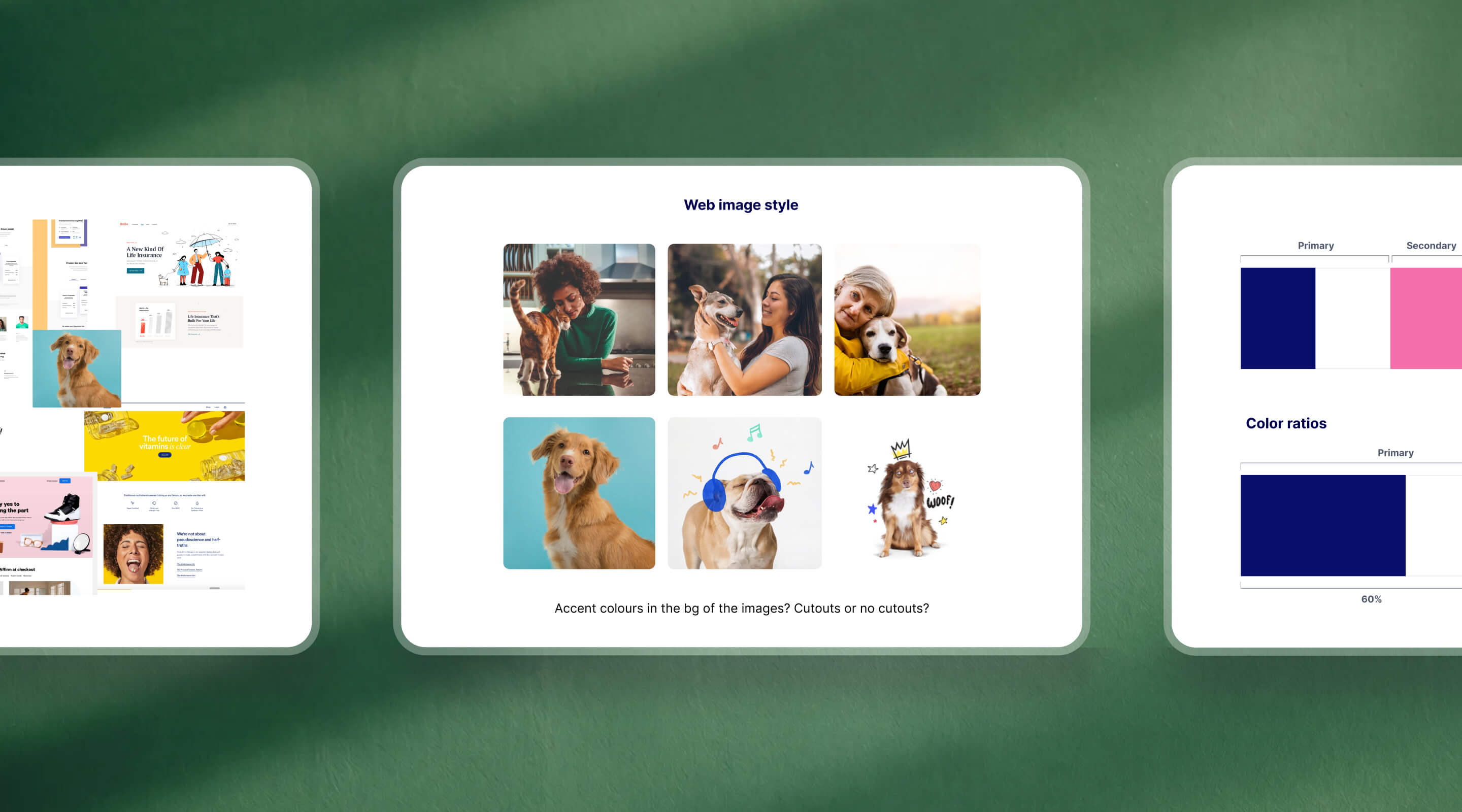
A couple of mood boarding sessions with marketing settled three things upfront: the overall look and feel, how colour and typography would work on screen and what imagery and illustration style we would go for. Agreeing them before the build meant we weren't reopening them in every component review later.

FOUNDATION DECISIONS
A moving brand only works if the foundation can take the hits. Three early calls did most of that work, which helped us scale faster later on.
To hit the launch date, I cut most of the motion specs and shipped only the components the launch needed.


Display type for web, a product scale for mobile
The big display fonts worked on marketing pages but fell apart in dense product screens. I set a separate H1 to H5 product scale that held up on mobile and information-heavy UIs.

A taxonomy designers and devs both read
I named tokens and components so designers and engineers understood them the same way. When someone needed to change something, it was obvious what to touch, so changes stayed quick and safe.
GOVERNANCE
The hardest part wasn't design. Engineers avoided shared components in case a change rippled across squads, and one-offs were risky while tests were running. They raised it. I proposed a three-state lifecycle so everyone knew what was safe to build on: new ideas start experimental and get trialled, prove reusable and they move to stable, get replaced and they move to deprecated.
🟡
Experimental
New components built for a test. Live in one place, not yet reusable
🟢
Stable
Proven and reusable. Safe to build on accros squads and markets.
🔴
Deprecated
Replaced and on the way out. Kept for reference, not for new work.
GLOBAL VS LOCALISED COMPONENTS
No competitor solved simplicity and depth simultaneously. High-scorers (Pawprotect, Figo) were comprehensive but dense. Low-scorers were cleaner but trust-poor. The gap was a flow that did both. That was our opening.
RULES REMOVED FRICTION
Adoption is the most important part of a design system. If no one uses it, all of the effort implementing it goes to waste. That is why I spent a lot of time making sure the design system is used correctly and is top of mind around the organisation.
THE HANDS-ON WORK
The direction and the governance only mattered because the components held up. I built the first Figma UI Kit off the patterns I was already making for US checkout, then extended it to shared UI across the UK and Sweden. Components matured version over version, tightening as the system grew.


SCALING THE TEAM
A system only one person can run isn't a system. I moved the team off Sketch and into Figma so everyone designed from the same components. After launch I split ownership: an engineer took on governance day to day, another senior designer owned the Frontify guidelines, and I kept the brand application while line-managing three designers across the UK and Sweden.
I also made the case to warm the brand up. The UI felt too corporate for a company people trust with their pet's health, so I argued for rounder corners and a more approachable feel, got buy-in, and reworked the style and the system to match

TRADE-OFFS
Direction is mostly about what you're willing to give up. Three trade-offs shaped this project, and each one has a result I can point to.
SCOPE
Cut scope and motion to hit the date
A complete kit nobody could use yet mattered less than being live. Result: shipped on schedule, then filled the system out once real usage showed what mattered.
CONTRAST
Conceded contrast where style mattered, held AAA where legibility did
I needed the quote and claims flows readable and the brand intact, not a perfect score. Result: an accessible product that still looked like ManyPets
SPEED
Shipped a provisional UI I knew I'd rework
Waiting for the brand to land would have cost the launch. Result: we stayed on track, and the foundation absorbed the rework when the brand changed
OUTCOMES
Unpack went from a personal Figma style guide to a system every squad shipped on, in the US, UK, and Sweden. It absorbed two rebrands without a component rebuild. When it went into Frontify, the whole company could use it, not just designers, and an internal survey scored it 80 out of 100 on how easy the tool and guidelines were to use.
REFLECTION
01
A design system is a team sport. If people don't use it, it fails. Buy-in from engineers, engineering managers, and marketing was the point, and the governance work mattered as much as the design work. The token architecture I set early was worth more than any single component I drew.
02
If I built Unpack today, I'd design it to be easy to plug into new tools. Systems evolve constantly, so what matters is surfacing the usage and the detail clearly enough that a new tool, or an AI, can read the system and make sense of it.
03
I'd use AI to draft documentation and speed up design to code, and keep the judgement calls, which battles to fight on brand and accessibility, with people. That's the part a system can't automate, and it's the part that made this one work.

