Zilch acquisition funnel optimisation

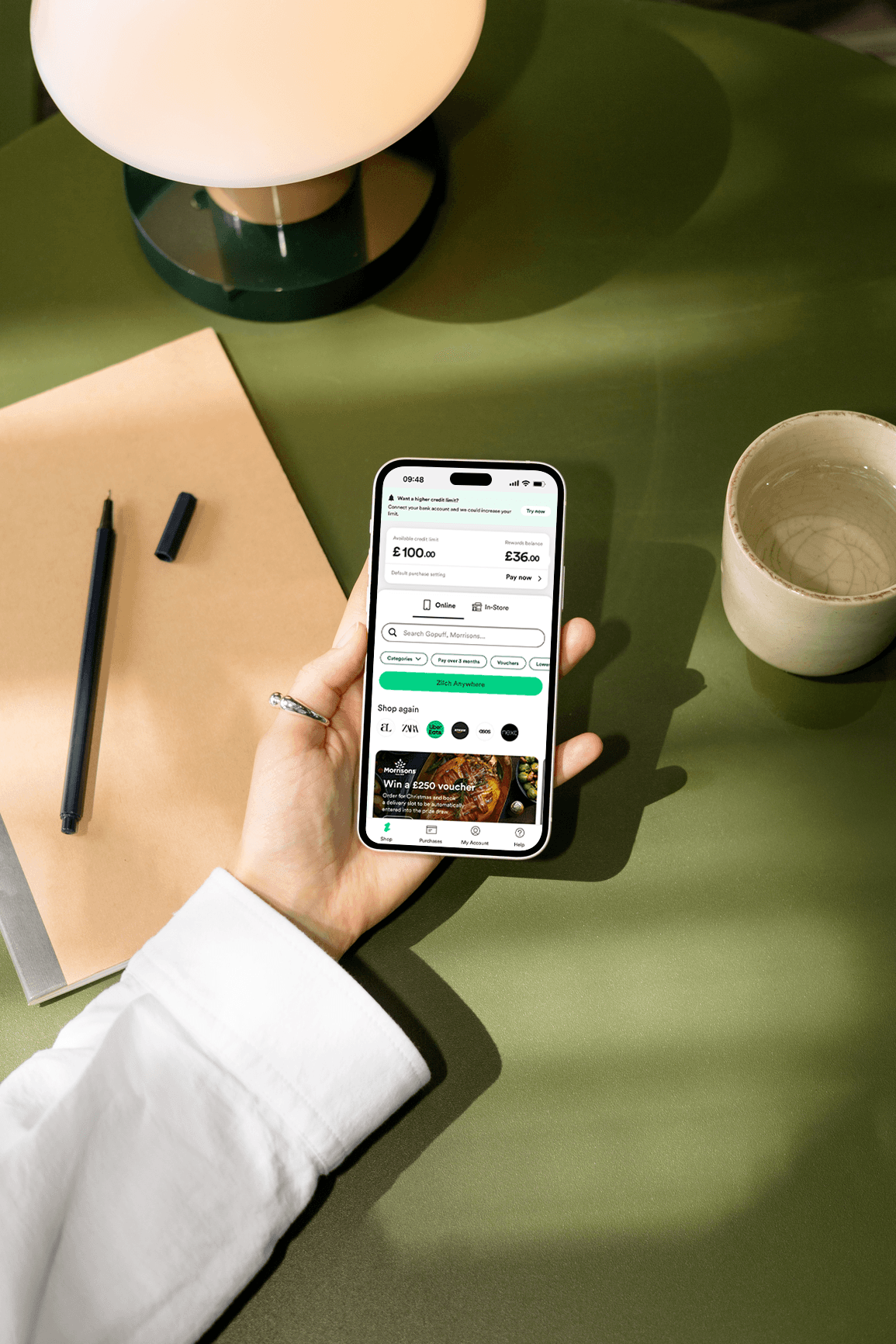
Zilch is a UK-based buy now, pay later (BNPL) platform serving over 5 million customers, letting shoppers spread the cost of purchases across interest-free instalments.

I was the lead designer on the Growth and Acquisition team, working alongside a PM, engineers, and a data analyst. I also closely collaborated with other teams accross other verticals that touched onboarding (Decisioning, Marketing, KYC team).

The business objective was to grow the number of users reaching M1 status (first spend) by fixing the leaks in an onboarding funnel that was turning away motivated customers and revamp the UI of the app to make the product more marketable.

Company type

Fintech, Scale-up

Time frame

18 months

Contribution

UX Research, A/B Testing, Product Design & Strategy, Analytics

5% โ†’ 12%

5% โ†’ 12%

140% increase in aggregator conversion

Peak overall conversion rate

ยฑ1-2k/mo

ยฑ1-2k/mo

Additional M1's (Month 1 speding users)

Additional M1's (Month 1 speding users)

-11.4%

-11.4%

Median TTC in a 30 day period

Median TTC in a 30 day period

65% โ†’ 79%

65% โ†’ 79%

Increase in users getting from leads to spend ready

Increase in users getting from leads to spend ready

THE PROBLEM

A broken and outated funnel where returning users got stuck.

A broken and outated funnel where returning users got stuck.

The funnel treated people who'd applied before, changed their details, or came back to try again as new customers. We handled these scenarios very poorly, so the experience broke for them, predictably, every time.

THE USER

35% of applications failed at phone verification. Users averaged 4+ login attempts per month. 40% who signed the RCA never completed IDV.

PRODUCT

No concept of a returning user. Existing email? Generic error. Phone number tied to another account? OTP silently failed to send. No routing, no recovery, no explanation.

BUSINESS

Since the funnel was so broken, the business had pure conversion loss on users who were already sold on the product. That said, each 1% conversion improvement could deliver ยฃ1.2M in lifetime value from 3k additional customers.

THE USER

No frame of reference for the product. US pet owners were not used with the concept of pet insurance but rather pet wellness products. The flow had to educate and convert at the same time, without adding friction.

PRODUCT

The UK product couldn't simply be copied. User behaviour, terminology, and expectations were genuinely different. Everything had to be researched and designed from scratch.

BUSINESS

ManyPets was going through a transformation, changing it's name from BoughtByMany in order to appeal more to the US customer. This meant that the new branding was developed along side the new flows which made the process more complicated.

A PIVOT IN PRODUCT STRATEGY

From chaos to clarity: Prioritizing what mattered most

From chaos to clarity: Prioritizing what mattered most

Before I could dig deeper into the core problems, our strategy was focused on stuffing more users into a broken funnel and being very reactive to problems that appeared along the way.

The PM at the time was focused on reaching web and mobile feature and visual parity, but I soon realised that by moving users straight into the app would remove the need to work on web entirely, saving us a lot of dev time and money.

We soon had a change in the team PM which resulted in a better collaboration and prioritizing the key problems I was eagerly awaiting to tackle.

RESEARCH

Starting at the top of the funnel and working my way down.

Starting at the top of the funnel and working my way down.

While the new PM settled in, I was already looking into the end to end experience, and trying to collate as much information and data as I could while working on how the upcoming brand refresh would be applied to the funnel. We then started looking into the top of the funnel (account creation) first due to the credential stuffing and increased fraud attempts we were experiencing.

TrustPilot & CS analysis

Surfaced recurring OTP and login failure patterns. The dominant theme: users unable to re-enter the funnel after a failed first attempt.

Data deep-dives by area

Started with top of funnel and account creation, where fraud attempts and credential stuffing were concentrated, then worked down through pre and post-IDV to spend-ready. No design work started until those events were properly instrumented in MixPanel.

Competitor analysis

Looked at how other BNPL products handled the top of their funnels. Almost none were running serious web sign-up flows while we did.

UI audit

Documented inconsistencies between web and app flows across every onboarding screen before any solutions were explored.

THE USER

No frame of reference for the product. US pet owners were not used with the concept of pet insurance but rather pet wellness products. The flow had to educate and convert at the same time, without adding friction.

PRODUCT

The UK product couldn't simply be copied. User behaviour, terminology, and expectations were genuinely different. Everything had to be researched and designed from scratch.

BUSINESS

ManyPets was going through a transformation, changing it's name from BoughtByMany in order to appeal more to the US customer. This meant that the new branding was developed along side the new flows which made the process more complicated.

MAIN FINDINGS

Three core failures spread across the funnel

Three core failures spread across the funnel

With the help of the data team, myself and the Product Manager started doing deep dives into the quant data as well as going deeper into the qual side, where I spoke with users, tried competitor apps and gathered insights from other teams such as Customer Service and Marketing.

Login loops and abandoned applications block future attempts

Users endure an average of 4 logins before becoming M1 customers, with 76% of these authentication loops occurring during onboarding. There was also no mechanism to "reset" their journey after a longer time away.

35% of users fail at phone verification step

This was happening because phone numbers were permanently linked to unverified emails with no recovery path available.

40% of users don't complete IDV

This was the third main drop off area, where we were letting users explore the app before they were verified with no education added prior to them seeing the app for the first time.

STRATEGIC DIRECTION

Opportunities I uncovered outside my team's area of focus

Opportunities I uncovered outside my teamโ€™s area of focus

Most of the roadmap was owned by product but the design team and myself were continuously spotting gaps in the product and thinking about the future vision, so we pushed to close them, with the help of the leadership team and other departments. Some of the opportunities I uncovered are shown below.

VISION ยท FUTURE ONBOARDING

Pitched the future of onboarding to CPO and VP of Growth

Moving the credit agreement and the push opt in page early in the funnel were adopted into the roadmap.

OPERATIONS ยท COMMS AUDIT

Mapped every message Zilch was sending, because nobody else had

Gaps closed, obsolete messages removed, future endeavours simplified. Marketing used it as a reference throughout.

IDV PROVIDER ยท ONFIDO

Took an IDV failure pattern straight to our vendor

24% of users went to manual review due to low lighting. Pitched a solution to Onfido for a potential improvement.

EXPERIMENTATION

Small UI/UX fixes leading to big and surprising results

Small UI/UX fixes leading to big and surprising results

While larger infrastructure changes were being scoped, I identified opportunities for immediate impact through a few key A/B tests. These would test some of my assumptions and deliver business value while I did the discovery on the rest of the funnel.

Before
After

MID-FUNNEL ยท A/B TEST

Simplifying the way credit limits were displayed

HYPOTHESIS

Showing both initial and maximum potential credit amounts would help users understand the growth opportunity and be more motivated to complete sign-up.

SOLUTION

Redesigned the limit display to show "Start with ยฃX, grow to ยฃY". A small UI change with clear intent: make the credit limit feel like an opportunity, not a verdict.

Results

+3,8% conversion increase. ยฃ1.054M net profit attributed. Ramped to all users after positive signal. A prime example of a small UI change having a significant impact on conversion

POST-SIGNUP ยท A/B TEST

Testing whether early education changes first spend behaviour.

HYPOTHESIS

Showing new users how Zilch works post-signup would increase the likelihood of a first spend.

SOLUTION

A 6-screen carousel explaining Zilch's key benefits, shown immediately after sign-up. Iterated on copy with user interviews before rolling out.

Results

+2% uplift in spend ready to first spend especially for higher credit limit tier users. Lower tier users skipped straight through. They wanted fast access to credit, not education.

Before
After

MID-FUNNEL ยท A/B TEST

Simplifying the way credit limits were displayed

HYPOTHESIS

Showing both initial and maximum potential credit amounts would help users understand the growth opportunity and be more motivated to complete sign-up.

SOLUTION

Redesigned the limit display to show "Start with ยฃX, grow to ยฃY". A small UI change with clear intent: make the credit limit feel like an opportunity, not a verdict.

Results

+3,8% conversion increase. ยฃ1.054M net profit attributed. Ramped to all users after positive signal. A prime example of a small UI change having a significant impact on conversion

POST-SIGNUP ยท A/B TEST

Testing whether early education changes first spend behaviour.

HYPOTHESIS

Showing new users how Zilch works post-signup would increase the likelihood of a first spend.

SOLUTION

A 6-screen carousel explaining Zilch's key benefits, shown immediately after sign-up. Iterated on copy with user interviews before rolling out.

Results

+2% uplift in spend ready to first spend especially for higher credit limit tier users. Lower tier users skipped straight through. They wanted fast access to credit, not education.

AREA 1 OF 3 ยท ACCOUNT CREATION

Switching to an email-first authentication

Switching to an email-first authentication

30% of phone numbers were already linked to another account, so OTPs silently failed. Email first let us detect existing accounts immediately and route people correctly. It also closed a credential stuffing vulnerability, since we could no longer confirm whether an email had an account.

DESIGN THINKING

Three principles before a single screen was designed:

  1. Users always have a path forward, regardless of what information they give us.

  2. We never confirm or deny whether an account exists, security first.

  3. Trusted devices get a low-friction experience. New devices get full verification, but only once.

This resulted in three iterations we planned for: the initial routing logic, an interim OTP fallback state, and a future state removing the 30-day session expiry.

DESIGN THINKING

Three principles before a single screen was designed:

  1. Users always have a path forward, regardless of what information they give us.

  2. We never confirm or deny whether an account exists, security first.

  3. Trusted devices get a low-friction experience. New devices get full verification, but only once.

This resulted in three iterations we planned for: the initial routing logic, an interim OTP fallback state, and a future state removing the 30-day session expiry.

OTP always sends

If a phone number was linked to another account, users were told clearly and given a path to their existing account.

Email collected upfront

Existing accounts detected at step one rather than being checked in the middle of the flow. Returning users routed to login and verified before hitting any dead ends.

Device-aware experience

Trusted devices get a streamlined login. New devices get full verification once, then trusted from that point forward.

AREA 2 OF 3 ยท PLATFORM STRATEGY

Moving users to app earlier instead of rebuilding web.

Moving users to app earlier instead of rebuilding web.

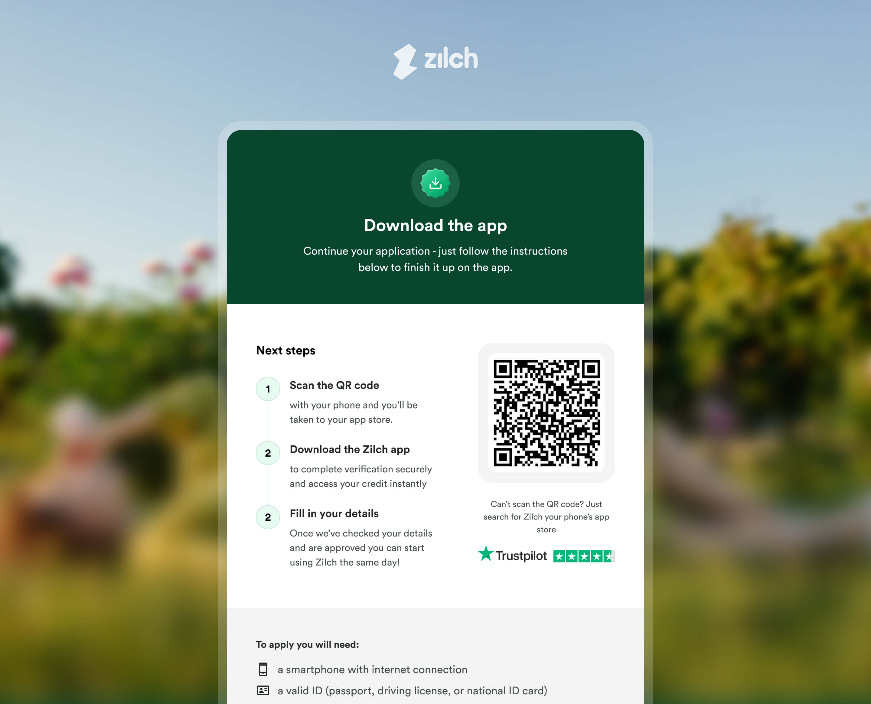
The initial plan discussed with my PM at the time was achieving full web/app parity. A competitor analysis changed my view on this: almost no BNPL company runs a serious web sign-up flow anymore. I proposed using web as a handoff point instead, moving users to app via a QR code.

DESIGN THINKING

Stop updating something which nobody else is using in the space

  1. Competitor analysis showed mature BNPL products had moved away from web sign-ups entirely.

  2. I also realised speaking with my engineering team that web exposes us to credential stuffing and it's also harder to track events

  3. Rebuilding web to match app would have taken us a whole iteration: 2-3+ months of work, still a second-best experience.

A QR code handoff: fraction of the cost, gets users onto the better product faster, eliminates the parity debt permanently.

DESIGN THINKING

Stop updating something which nobody else is using in the space

  1. Competitor analysis showed mature BNPL products had moved away from web sign-ups entirely.

  2. I also realised speaking with my engineering team that web exposes us to credential stuffing and it's also harder to track events

  3. Rebuilding web to match app would have taken us a whole iteration: 2-3+ months of work, still a second-best experience.

A QR code handoff: fraction of the cost, gets users onto the better product faster, eliminates the parity debt permanently.

Web as entry point, not product

Users get a compelling prompt to continue on app via QR code rather than a degraded web experience.

Cleaner security posture

Removing web sign-ups eliminated the credential stuffing attack surface that had been a persistent vulnerability.

Parity debt gone

One codebase, one journey. Every future improvement applied everywhere rather than being built twice.

AREA 3 OF 3 ยท FIXING TASK COMPLETION RATE

Changing the IDV behaviour so users don't have to guess if they can use the app or not

Changing the IDV behaviour so users donโ€™t have to guess if they can use the app or not

40% of users who signed the credit agreement never completed IDV. While their ID was checked, they'd land in a shopfront they couldn't use, with no idea why. I redesigned the pending states, moved notifications earlier so drop-offs could be retargeted, and shifted the RCA to after IDV.

DESIGN THINKING

A further iteration for users who came back after dropping off.

  1. Initial fix was straightforward: make the pending state clear, give users next steps, send accurate comms.

  2. Second problem emerged: users who applied and dropped off at the IDV then returned after a gap of time had a poor experience

  3. Designed a re-engagement screen: "Your credit limit is waiting for you." and aligned the comms with marketing

This solution had product logic implications: users past the expiry window needed their application reset. Worked through every edge case with engineering and my PM before handoff.

DESIGN THINKING

A further iteration for users who came back after dropping off.

  1. Initial fix was straightforward: make the pending state clear, give users next steps, send accurate comms.

  2. Second problem emerged: users who applied and dropped off at the IDV then returned after a gap of time had a poor experience

  3. Designed a re-engagement screen: "Your credit limit is waiting for you." and aligned the comms with marketing

This solution had product logic implications: users past the expiry window needed their application reset. Worked through every edge case with engineering and my PM before handoff.

"Your credit limit is waiting"

Users who returned after dropping off IDV were met with a targeted screen. Those past the expiry window had their application reset cleanly.

Clear pending state

Users knew exactly where they were and what to expect, instead of landing in a shopfront they couldn't use.

Credit Agreement moved post-IDV

M1 status only set after full completion. No more phantom M1s from users who signed the agreement but never finished IDV.

OUTCOMES

More users through the funnel, same acquisition spend.

More users through the funnel, same acquisition spend.

Every conversion improvement here is a motivated user recovered, not a new one acquired.

+24%

Relative conversion rate improvement

Overal funnel conversion increase from 13.2% to 16.4%

+24%

Relative conversion rate improvement

Overal funnel conversion increase from 13.2% to 16.4%

-72.5%

Login friction

Reduced from 4 attempts to 1 in a 30 day period

-72.5%

Login friction

Reduced from 4 attempts to 1 in a 30 day period

Bonus: Built a Custom MixPanel dashboard

I built this dashboard from scratch to track OTP success rates, email verification completion, desktop-to-app transitions, and median TTC. We mostly used mixpanel for our main metrics but not for any UX specific metrics so this was a great addition to our data pool.

Bonus: Built a Custom MixPanel dashboard

I built this dashboard from scratch to track UX metrics specifically such as OTP success rates, email verification completion, error rates, and median TTC

WHAT I LEARNED

I went from running tests to deciding what was worth testing.

I went from running tests to deciding what was worth testing.

Zilch helped me grow my knowledge about data and how it can support strategic decisions if you know where to look for evidence. After running multiple experiments, I became the person deciding what to instrument, what to deprioritise, and what not to build until the data justified it.

The biggest shift was learning to see gaps nobody had asked me to look for. The future onboarding pitch, the comms audit, the Onfido conversation, none of those were in my brief. They came from staying close enough to the problem to spot what was missing, then having the confidence to take it upstairs. That's the strategic part of the job: deciding what's worth doing before anyone asks you to.

Doing the market research before touching Figma was the best call on this project. Because we understood US users and their context before we built for them, we had very few structural fixes post-launch. We spent that time on improvements instead of corrections.

The personalisation round taught me something I hadn't expected. Adding the city skyline, breed icons, and condition-specific copy moved conversion from 5% to 12%. Not because the flow worked better functionally โ€” it already did. Because users felt like the product was built for them specifically. In a category where trust is hard to earn, that matters more than most things.